
Vistaprint
CUltivating Confident configuration
Agency: TheLab NYC
Role: Product Design Lead
Team: Designers, Product owner, Project Manager, Developers
• Data analysis
• Responsive e-comm web design
• Information architecture
• Prototyping
• User testing
• UI components
• Photography direction
Outcome
23%
increase in task completion
8
weeks from kickoff to dev Hand-off
—
The Goal
Reduce bounce rate, increase retention.
Vistaprint, a pioneer in custom printing for small business owners, wanted to reduce bounce rate by improving the product configuration experience of their Labels & Stickers product vertical. With a low order completion rate of 0.8-9.0% across Labels & Stickers products, how could we retain customers and help them progress to completed orders?
Opportunities
Help customers understand options
Simplify and unify the shopping experience
Retain visitors to create conversion
Constraints
A new business relationship with undefined goals and roles
Different product owners for parts of the flow, with varying priorities and timelines.
Time, tech and production constraints for the scope
My approach
collaboration and communication to navigate ambiguity
This was an unusually ambiguous new client-agency partnership with undefined goals. I actively drove progress by continuously asking questions, steering design and process, and fostering collaboration.
Discover
I worked with Vistaprint stakeholders to understand their business, team structure, processes, industry, customers, and previous design iterations.
Define
Collaborating with the Vistaprint product owner of configuration, we evaluated research data, customer feedback, and performance indicators to decide on a first project, prioritizing user needs, action steps, and technical feasibility.
Alignment
I regularly involved stakeholders from both the client’s team and the agency's team, establishing trust and co-creation. To drive progress, regular check-ins were scheduled to discuss challenges and expectations, and to gain insight and understanding.
UNderstanding
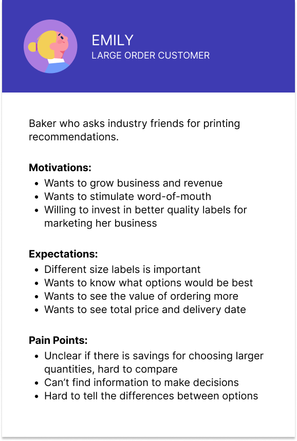
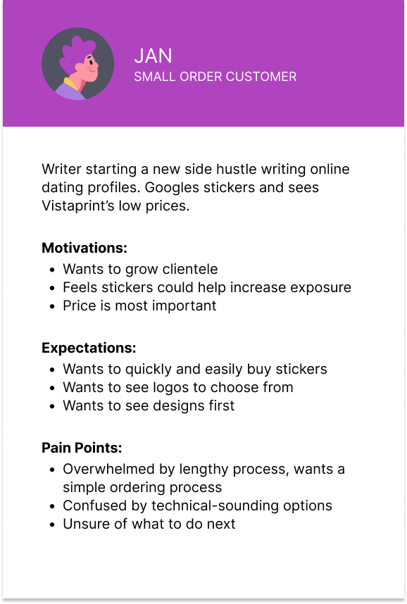
Who is this for?
Small business owners. Based on Vistaprint’s data, I created two personas to reference throughout the project, to ensure design would align with customers' motivations, behaviors, and expectations.
The Initial Ask
Explore improvements to product configuration.
However, to me this didn’t seem to align with the goal of reducing bounce rate.
Leveraging insights from user interviews, I pivoted design objectives to other areas for improvement that would help reach the business goal and align with user needs.
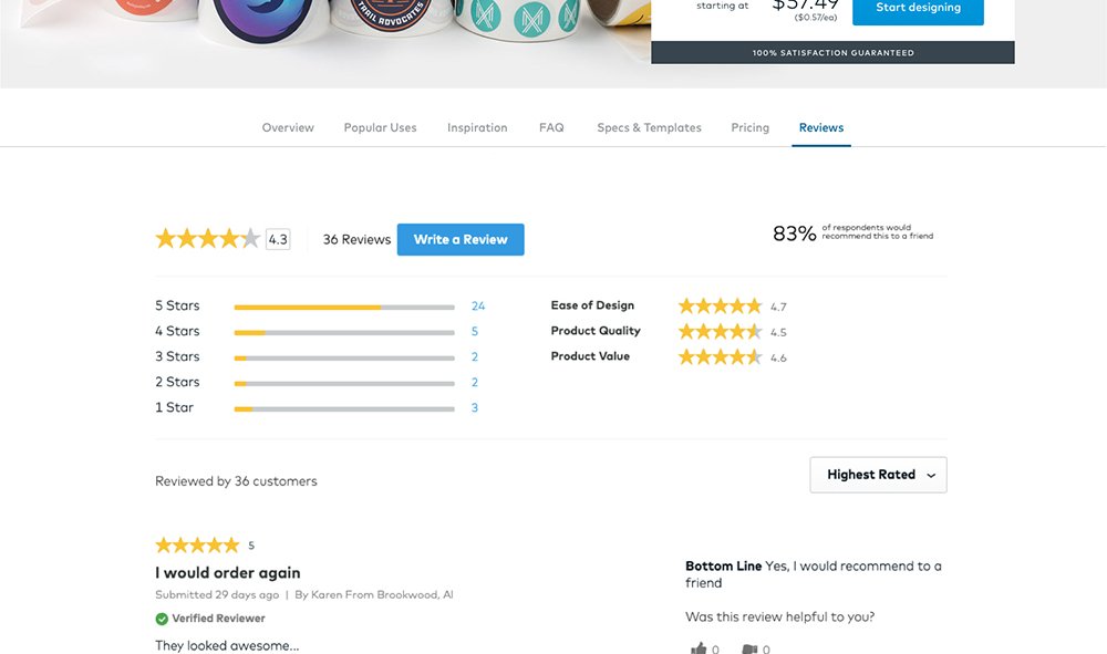
Why are people leaving the flow?
The problem wasn’t necessarily the configuration method. Testing the usability of Vistaprint’s Labels & Stickers and three competitor sites revealed that small business owners responded most positively to the following, which the Vistaprint Sticker flow did not meet:
X Seeing sticker designs first
X Compact configuration (no scrolling)
X Price transparency, especially reflecting savings on larger quantities
X Information at the right time and place to help make decisions
X Contextual usage examples to explain product properties
X Guidance and assurance for less tech-savvy users
Design Priorities
Given the timespan, we identified which needs to solve for to create the greatest impact.
I want to see designs first
I need information to make decisions
I want to compare costs
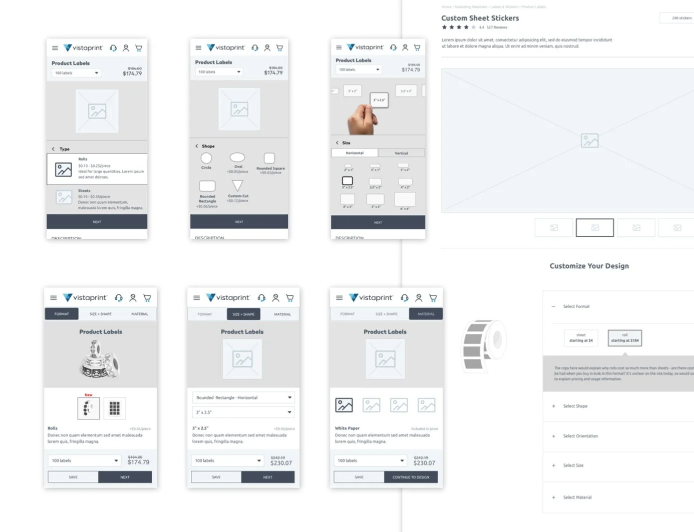
Exploring
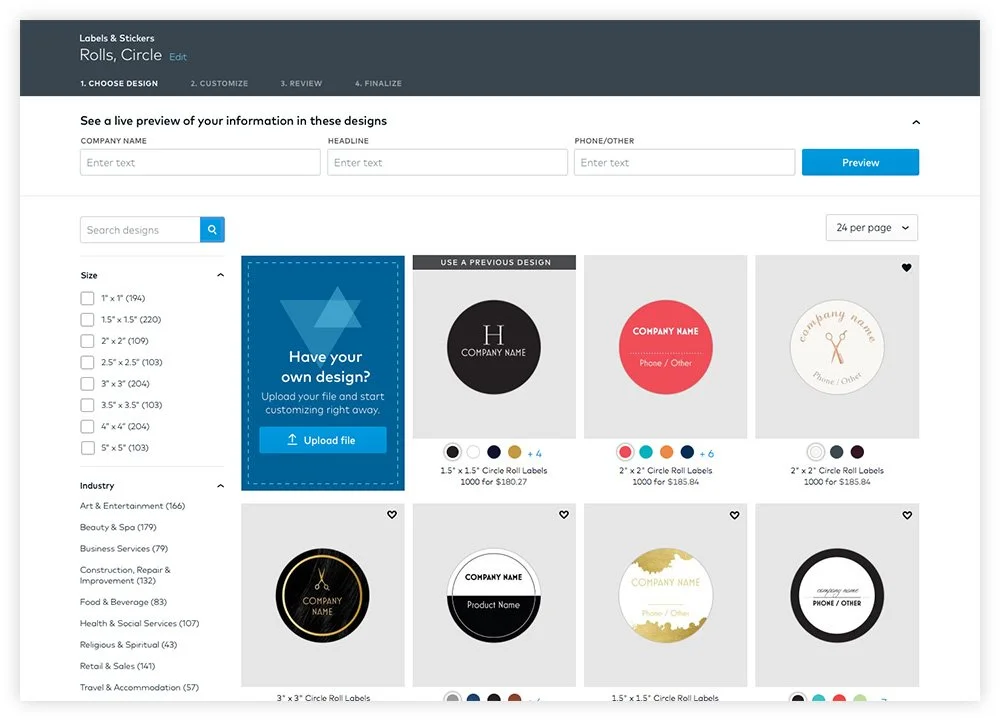
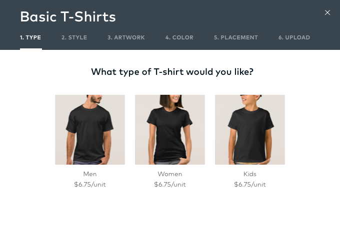
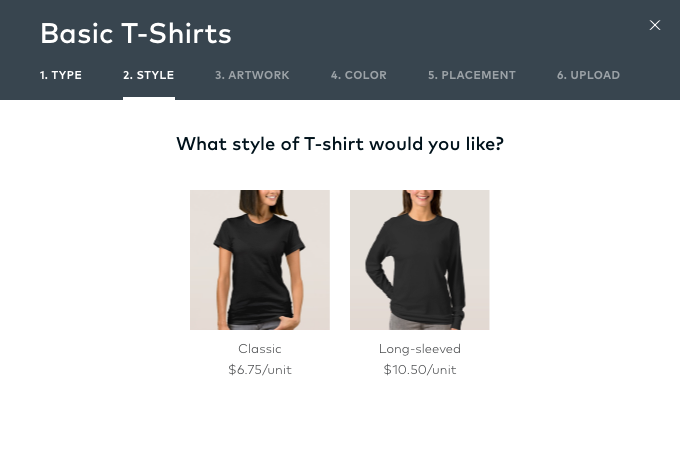
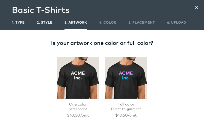
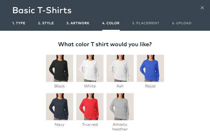
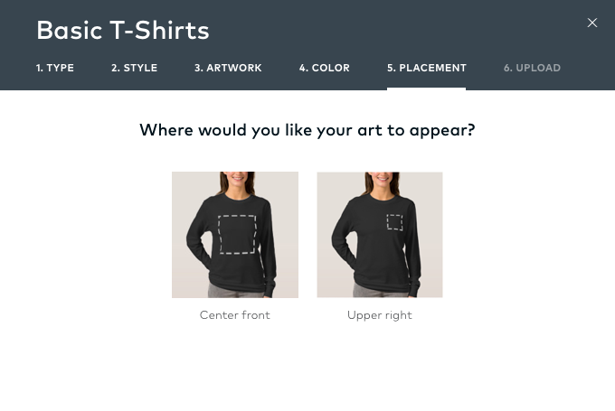
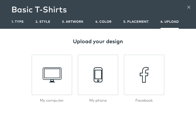
1. Seeing Designs first sooner
Reordered configuration flow
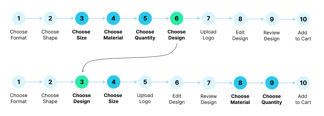
Designs first were not a possibility due to technical constraints. To work around this, we broke up configuration to align with the order that users thought of making a custom lable, resulting in two mandatory ones to start, which reduced roadblocks and achieved:
Less tasks to get to design templates
Configuration without scrolling
Visibility of product information
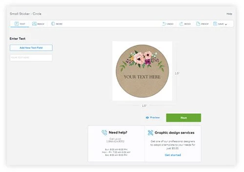
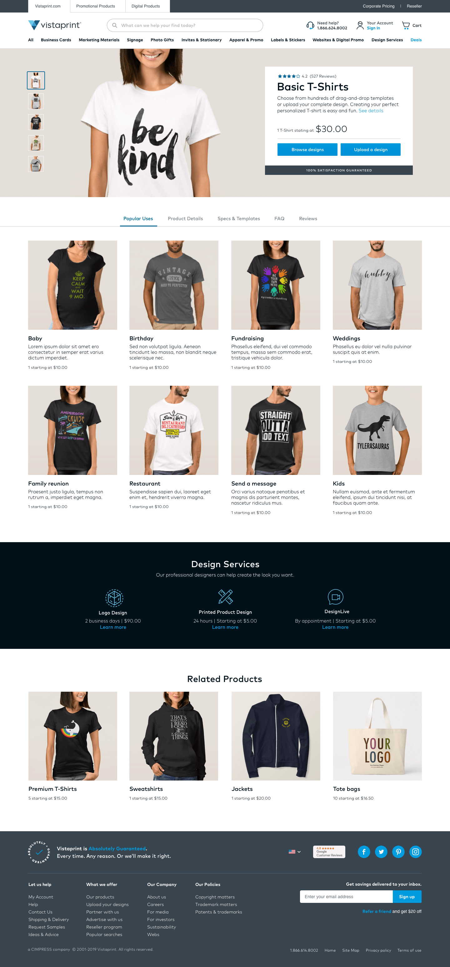
Original Product Detail pages with up to seven configuration decisions
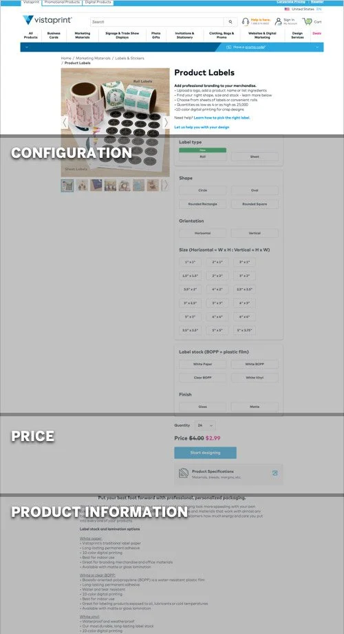
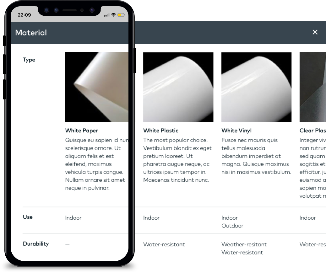
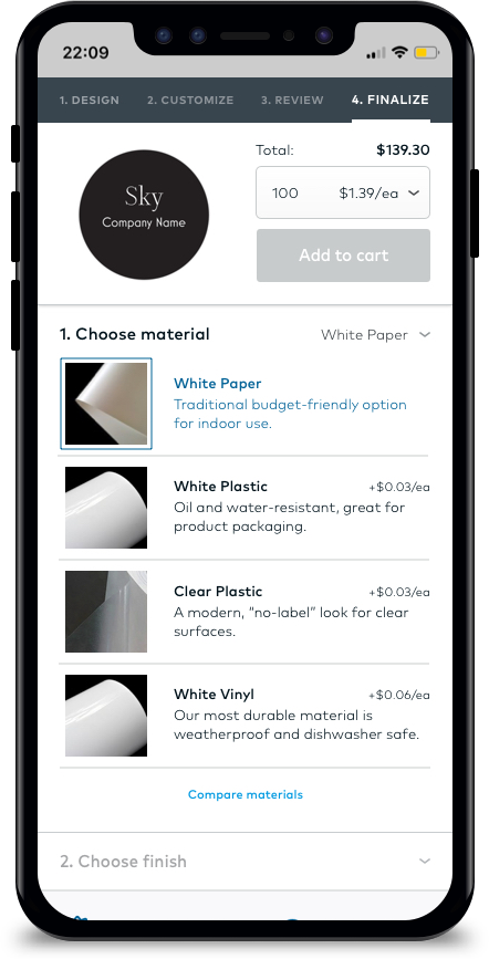
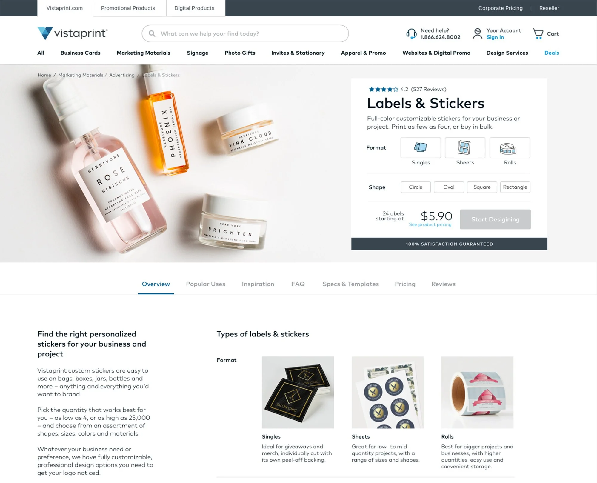
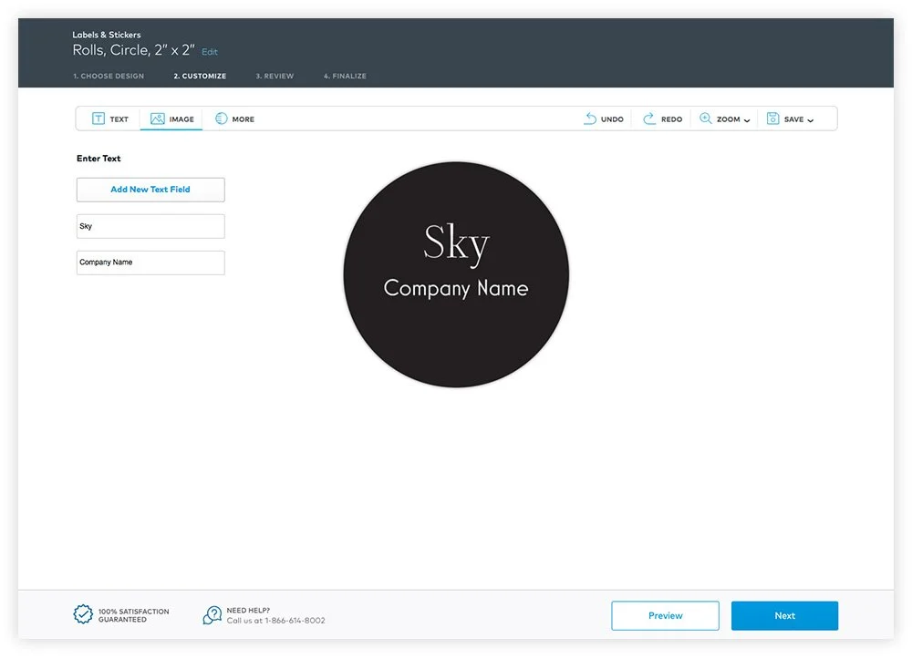
2. Product Information
Where is it? Customers could not find information to make decisions. Sometimes there was no information, sometimes it was hidden at the bottom of the page due to lengthy configuration.
Tabbed Information
Reducing initial configurations allowed product information to be “above the fold”. Tabs allowed flexibility for varying types of information relevant to the user.
Tabbed product information (desktop)
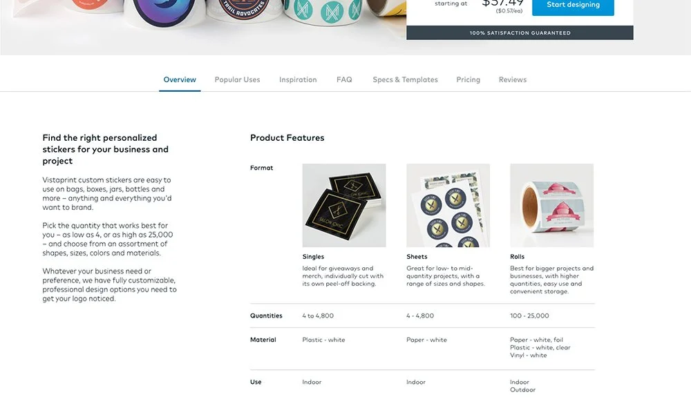
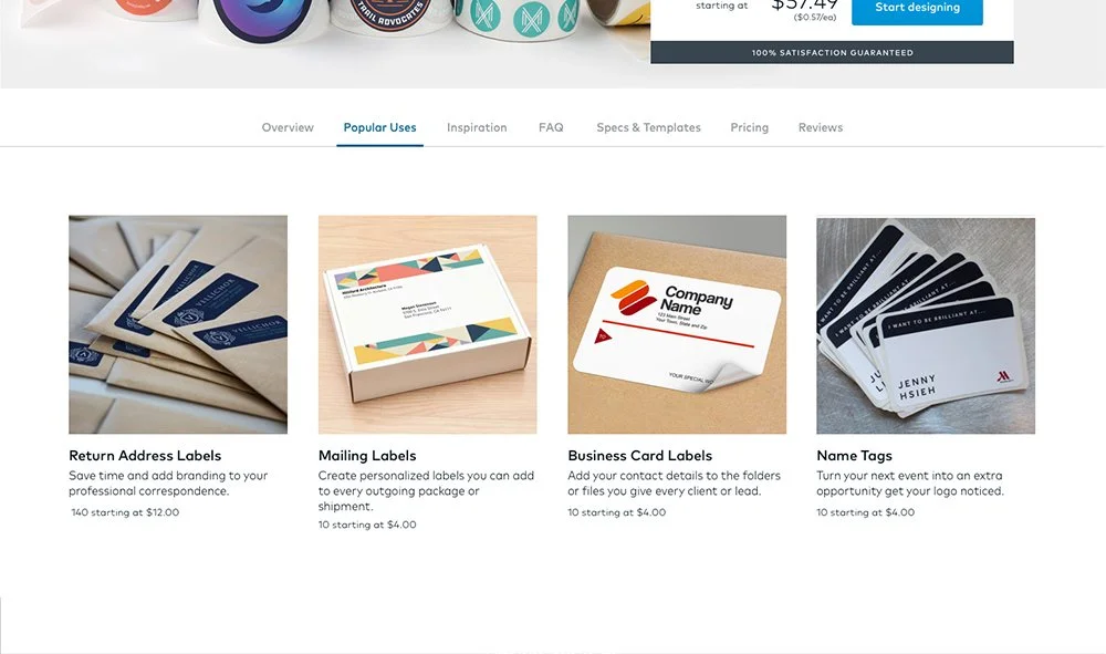
Comparing Information
Detailed consumer-friendly descriptions and photos helped differentiate configuration options. Consumer-friendly language also replaced industry terminology (ie. Material instead of Substrate, Plastic instead of BOPP)
Comparative Information (mobile)
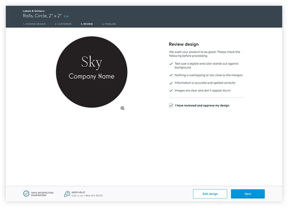
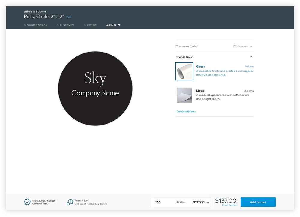
3. Cost Transparency
For business owners, cost is a significant factor in determining purchase decisions. Total cost had been displayed, but per unit cost was buried. Default quantity values were inconsistent — from a minimum to recommended or popular amount.
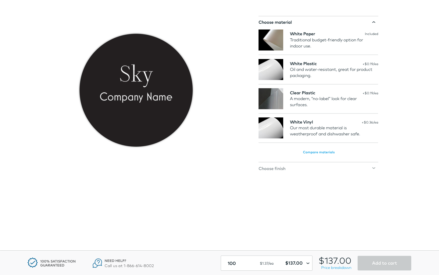
To enable small business owners to easily compare costs and decide what would be best for their needs, I added cost per unit wherever price was indicated:
Initial configuration
Product information tab
Quantity selector
Cost breakdown “Price details”
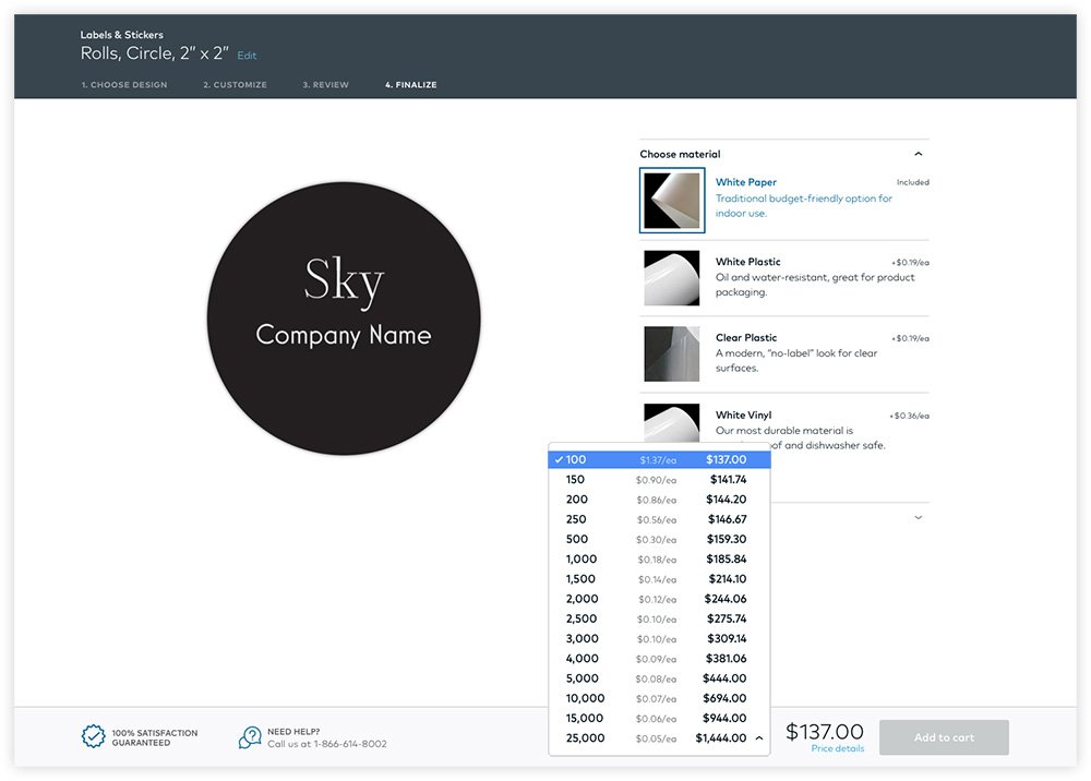
Final configuration with cost per unit incorporated
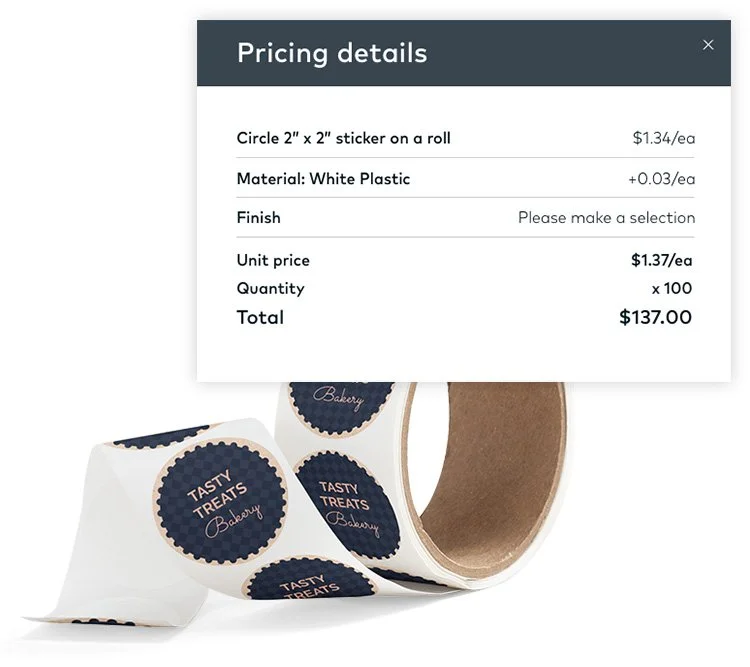
Detailed price breakdown of total cost
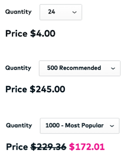
Examples of original default price values
In addition to designing for user needs ,
I took initiative to solve for a disjointed experience
4. Unifying the flow
With different product owners, and configuration now split into bookends, I wanted to create a cohesive customization process to mitigate confusion and set expectations and assurance. What’s feasible, with minimal effort and no disruption to other product owners — across every page in the flow?
New product page
Stickers templates page
Studio page with green CTA
New final configuration page
4-step Progress Indicator
I introduced a simple progress bar at the top of every page, indicating configuration steps and an option to go back and edit.
Assure confirmation and point of progress
Set expectations
Reduce uncertainty
Pinned next step - making it obvious
Inconsistent button placement and did not align with existing UI patterns in the design system. I created a consistent pattern for “Back” / “Next” buttons, pinned to the same location, creating
Consistent visual pattern and placement
Automatic reflex of where to look
Progression towards checkout
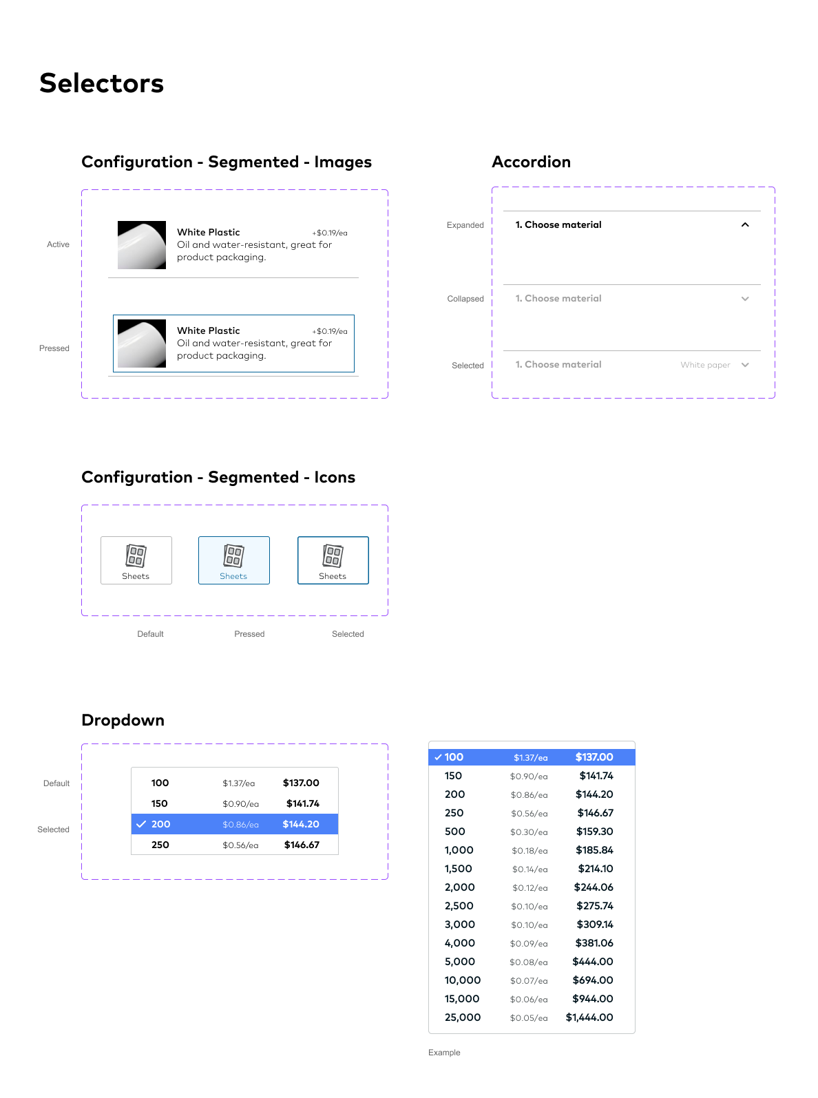
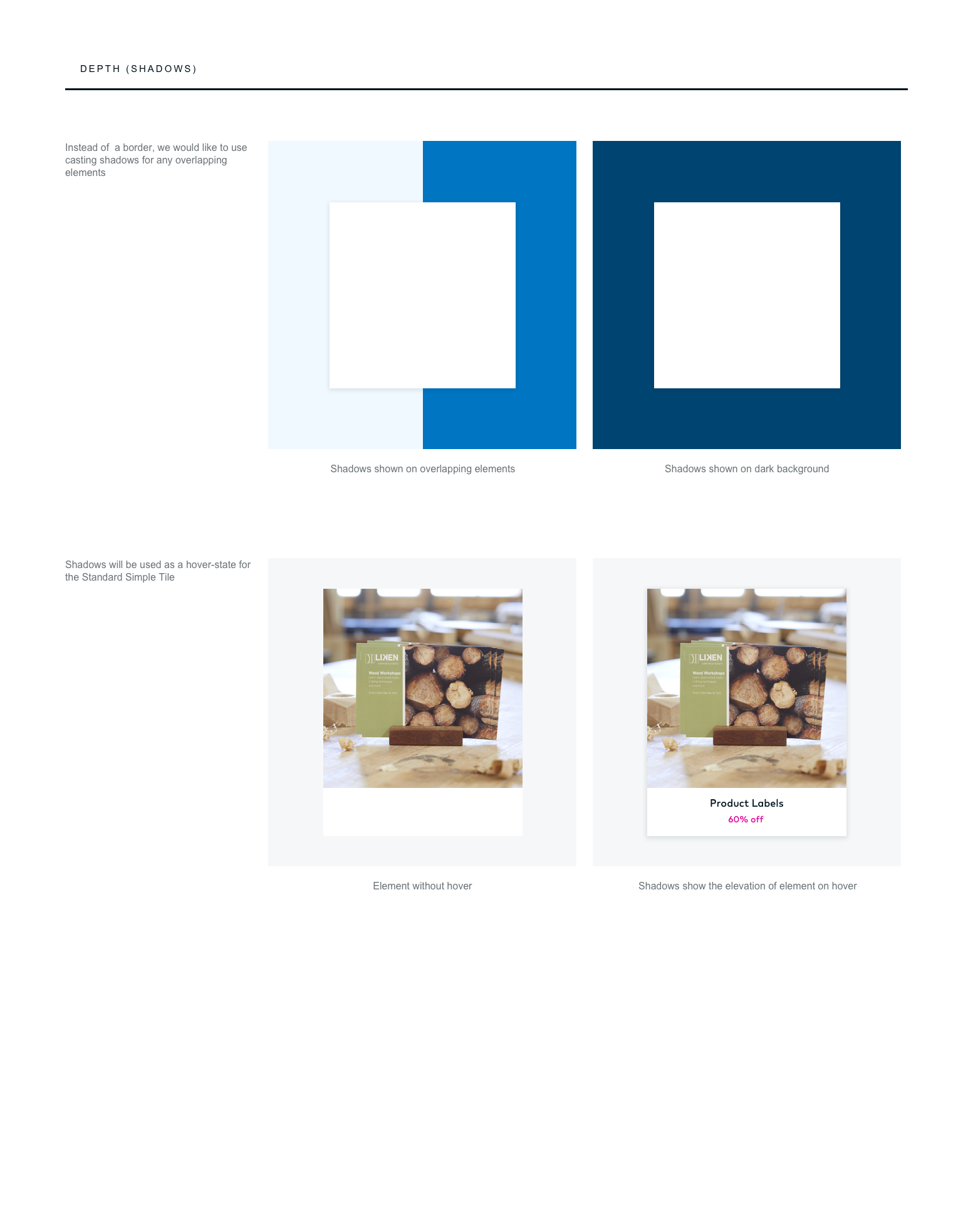
4-Step Progress Indicator and Pinned “Next” button
"This is smart, you’re thinking about it from the perspective of a customer.”
Refine
Would this work for other product Verticals?
Testing the new Labels & Stickers design with small business owners, they were able to accomplish finding what they wanted, understood choices, and were able to complete configuration without hesitation. They appreciated information like cost per unit and details on materials and finishes.
further iteration on configuration Method
Analyzing product verticals site-wide revealed that our first solution would not work site-wide. Products like wedding products were offered by theme or timeline, eliminating the need for upfront configuration. These findings opened up further exploration.
Other Product Verticals
We moved configuration choices to a modal with a binary CTA choice: “Browse designs” or “Upload a design”. This would keep product information tabs in view, while having flexibility for any number of configurations. It would also enable customers to bypass the Gallery if they already had their own designs.
Binary choice replaces initial configuration
Configuration in pop-up modal
Product-specific information
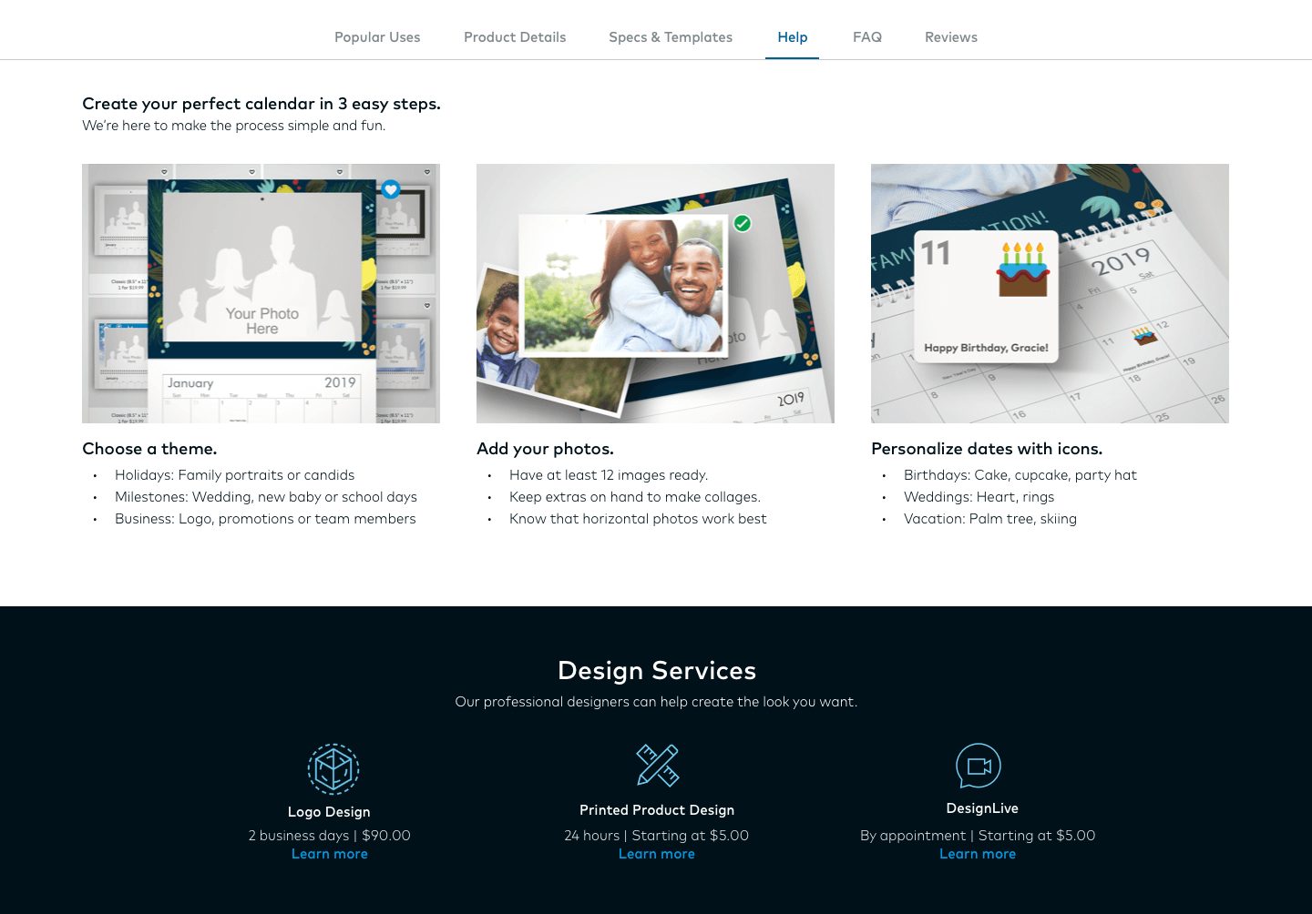
Some products had unique additional information. The tabbed information format proved to be a valid solution, allowing flexibility for additional product-specific information.
Information tabs on Banners product page
Information tabs on Calendars product page
Outcome
To test designs with real customers, we implemented the new design on a smaller subset of the market—Vistaprint Ireland (73.7k visits. compared to 6.2M on the US site). The impact of my contributions led to:
✔ Improved task completion rate of 25%
✔ Aligned customer expectations
✔ Cross-sell areas of opportunity
✔ Foundational improvements to be explored site-wide
✔ Stronger process and collaboration
✔ Increased efficiency in process
✔ Helped define roles, responsibilities, and goals in a new business partnership
If given next steps, I would encourage improved collaboration and involvement between product teams to create a more comprehensive user experience — ultimately increasing customers and revenue. Additionally, I would:
Conduct more testing to avoid false assumptions. Initial research had assumed drop-off was due to Labels & Stickers configuration method
Test the value of preset configuration offerings (like mailing labels)
Test new features to maintain competitive edge, like dynamic live preview
Identify and analyze other usability factors like navigation, taxonomy, ux language, pricing.