
Citibank
Bringing History to Life
Role: UX/UI Design
Agency: RuderFinn Interactive
Citibank, a global financial institution born in 1812 in NYC, wanted to create a timeline on their internal site for employees to learn about the company’s history. I lead design focusing on creating an engaging experience to help tell Citibank’s rich heritage.
The challenge
Tell citibank’s story in a compelling way
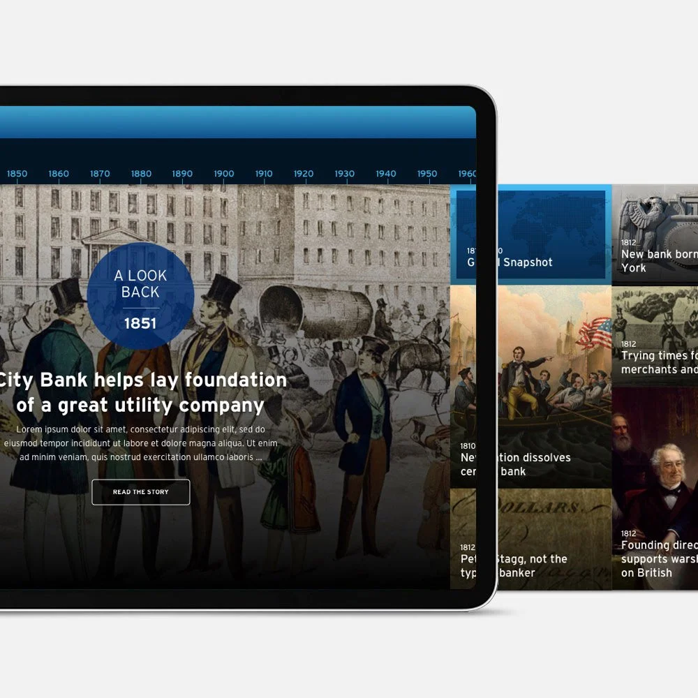
So many company timelines list their milestones as bullet points on a line, but they often look and feel like an ordered list and don’t convey the whole history. My objective was to create a timeline that both illustrates the breadth of Citibank’s history, and highlights significant milestones that helped form who they are today.
DIVING IN
I started by researching a variety of company timelines and reviewing samples of content that Citibank wanted to include. My takeaways:
• Traditional timelines on a bulleted line are usually limited to 1 milestone per date and don’t allow for much imagery.
• Image-heavy timelines tell more of a story, but have a narrow focus, often structured on each milestone like a slideshow.
• “Non-designed” timelines simply list dates and paragraph, feeling the least engaging, like a report of facts.
From Big Picture to Details
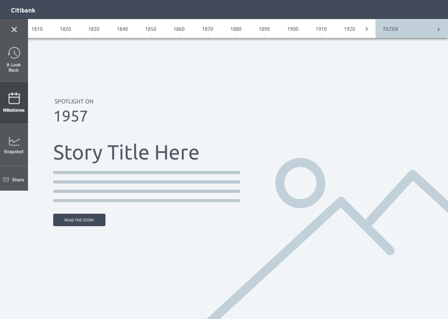
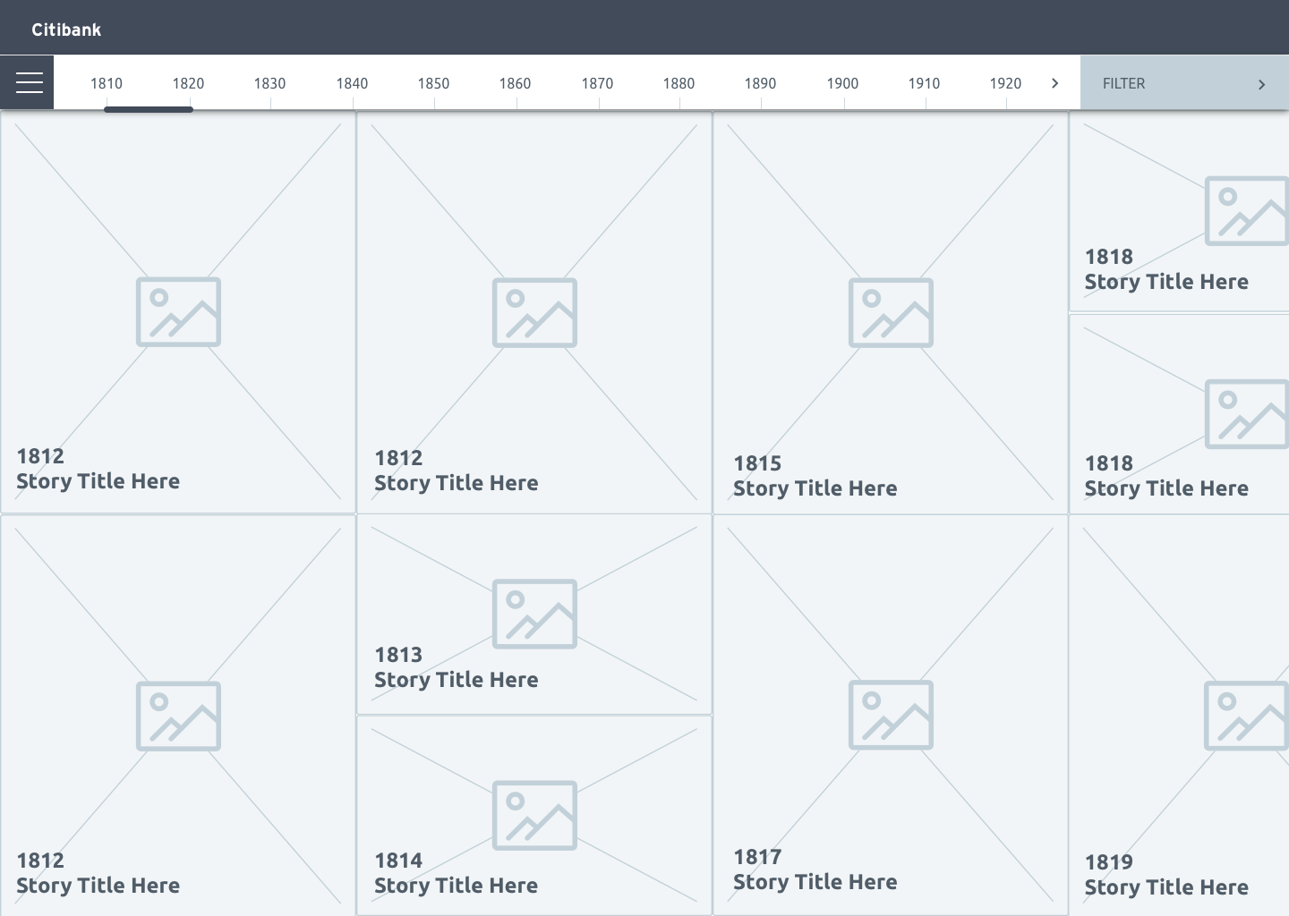
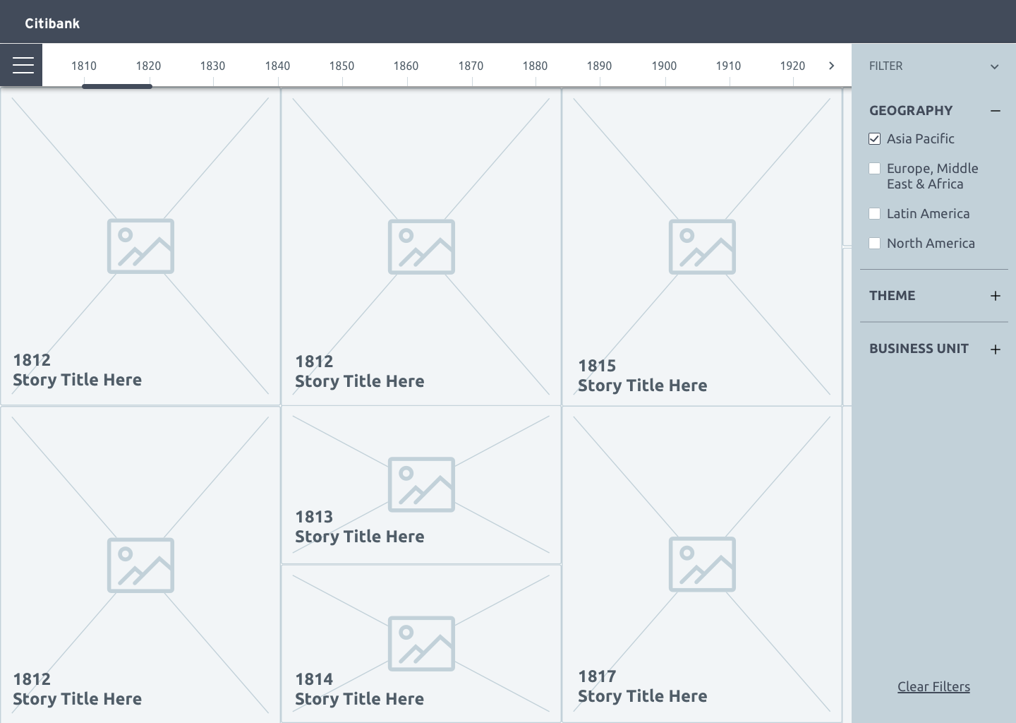
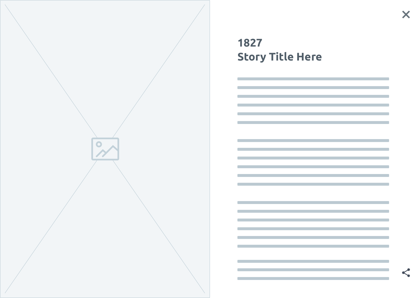
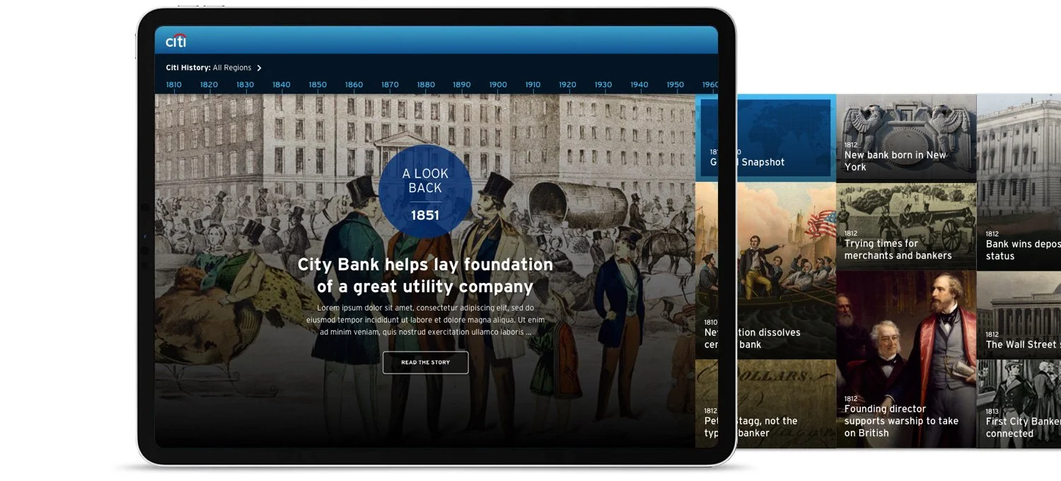
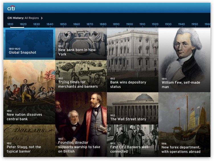
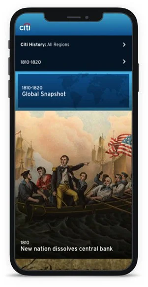
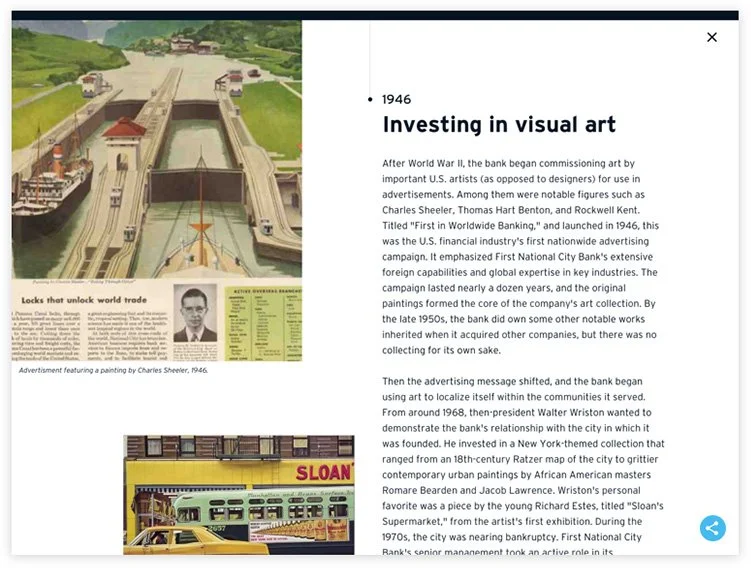
The purpose of this timeline was meant to be engaging, not just informative. I ideated different ways to illustrate the company story as a whole while also showing key events. Inspired by patchwork quilts weaving together a story, I decided on a grid of thumbnails to portray both the whole story and it’s key moments. The grid would provide flexibility to account for instances when more than one milestone falls in the same year. Clicking on each thumbnail would reveal more details about that milestone.
Navigating
There would still be a time “line” as well, that one could use to navigate. Users would have the flexibility of exploring by scrolling through the patchwork of stories or by jumping to a specific decade on the timeline.
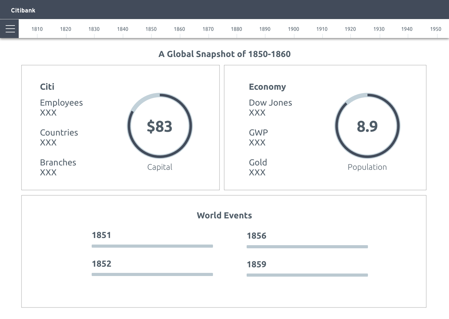
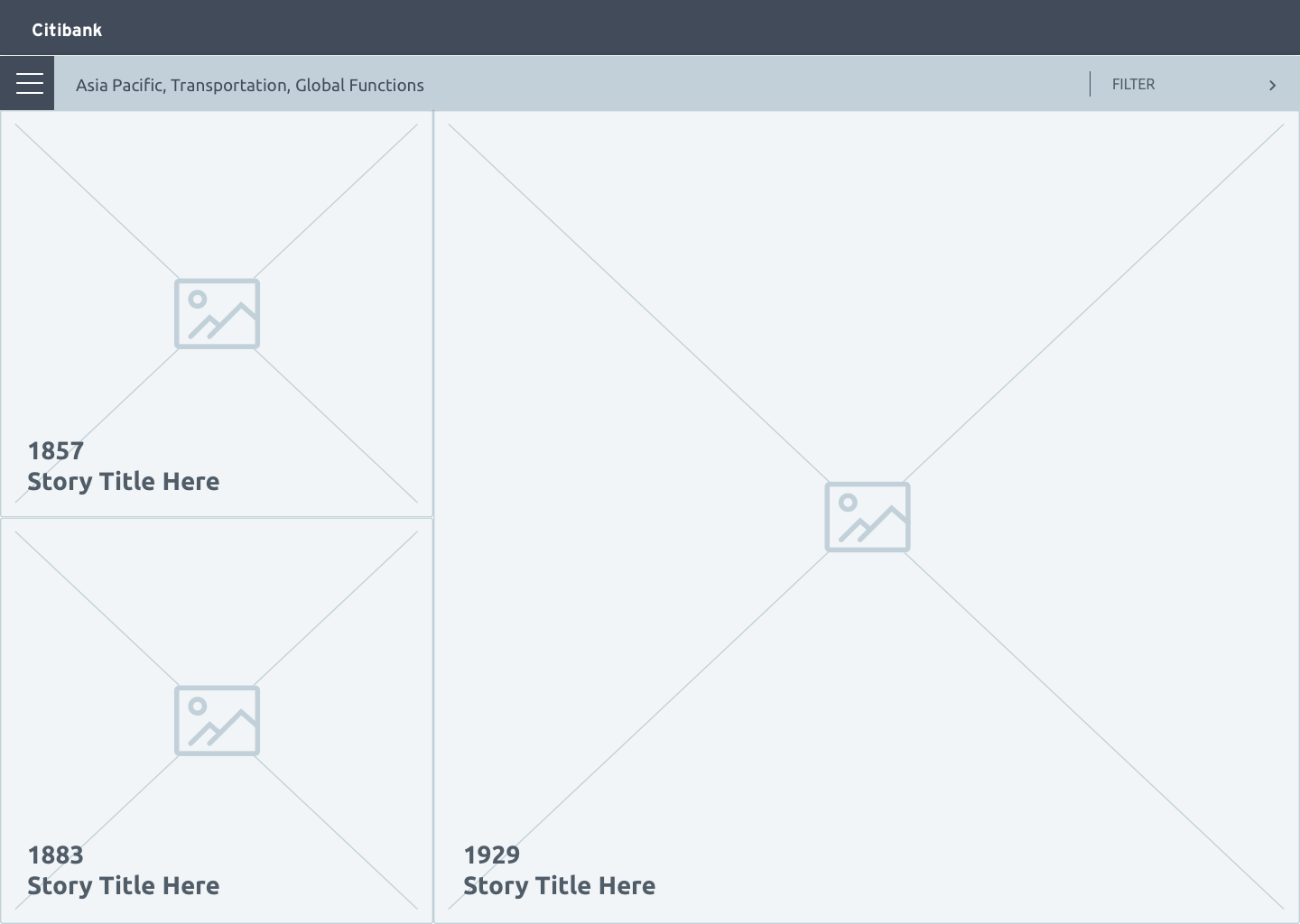
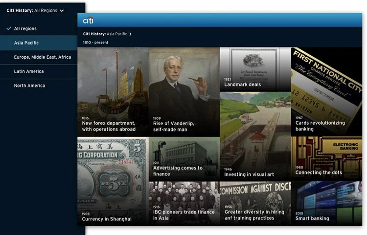
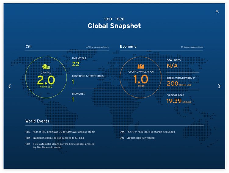
To add historical context, Citibank decided to add global indices and events. Originally, there was a “menu” to navigate to the featured story, the timeline, and global snapshot, but it became clear that this menu made the experience more cumbersome, with stories and global snapshots having separate timelines. I revised this while designing UI to be a less complicated, more streamlined experience, ditching the menu and incorporating the snapshots into the grid at the start of each decade.
Filtering
Citibank also wanted the stories to be able to be filtered. However, there was not enough content to justify this amount of filtering, so we decided to keep Geography only, based on the types of content available.
Visual Design
Since this project relied heavily on the impact of visuals, I proceeded from wires to visual design before gathering stakeholder feedback. While working on the UI, I was able to further rethink navigation and filtering. Placeholder design was used for stories, as they would be developed in the next stage, and would involve understanding content variations to create efficient templates.
Outcome
Initial feedback from Citibank was positive. If I had the chance to continue iterating, I would consider other ways to display the filtered timeline. I would also track how people navigate, the amount of clicks into stories, how much time people spent reading stories and whether they reach the end of them, and whether people explore beyond the initial featured highlight on landing. I would interview employees to find out what they responded to most, and how they felt about the navigation options. I would also track the number of visits derived from sharing.