
TheLab NYC
Showcasing expertise & Value
Client: TheLab NYC
Role: UX/UI Design Lead
Team: Copywriter, Developer
• Digital experience strategy
• Content strategy
• Website design

Outcome
4
weeks from kickoff to deliverables
—
The Goal
TheLab wanted a new website to reflect who their current capabilities, after years without a redesign. They had evolved from a production company to a full-service multi-disciplinary agency. A much needed update would represent their expanded capabilities and show the value they offer potential clients.
I had a long-term relationship as a repeated contractor with intuition and proven results. TheLab knew they could rely on me to work autonomously to create their new website while they focused on client work.
“WE JUST NEED SOMEONE WE TRUST WHO CAN BE DEDICATED TO GETTING THE THING DONE.”
— Design Director, TheLab
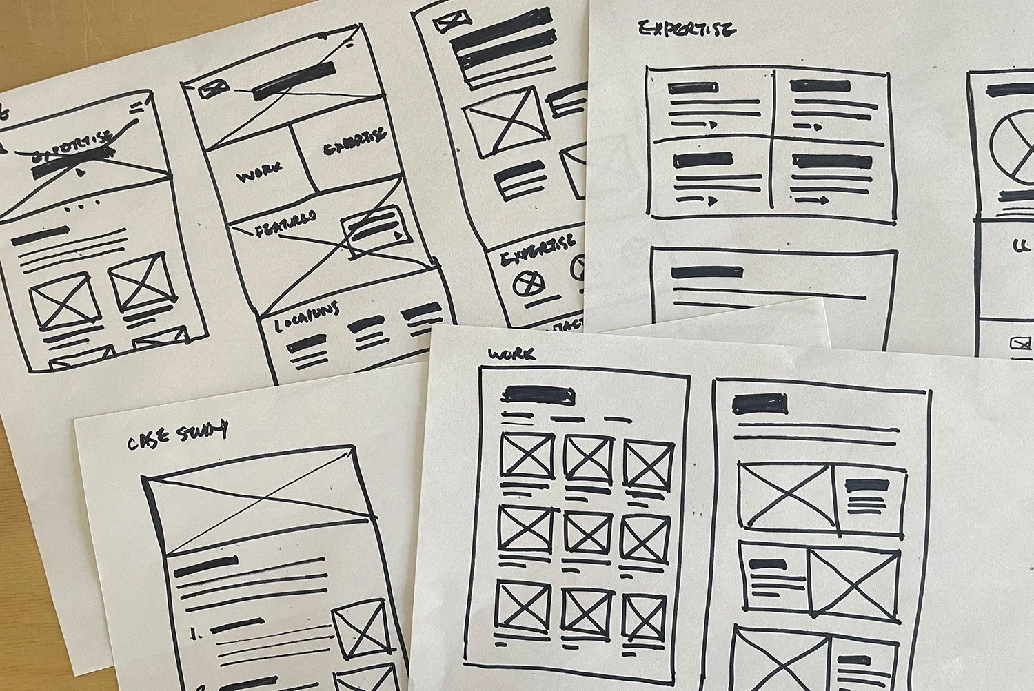
Discovery
I started by interviewing stakeholders to find out their goals and pain points. I also analyzed the legacy website to to get a feel for what information was included and how it was communicated. There were no requirements other than keeping their logo. The website was outdated and did not reflect their current capabilities.
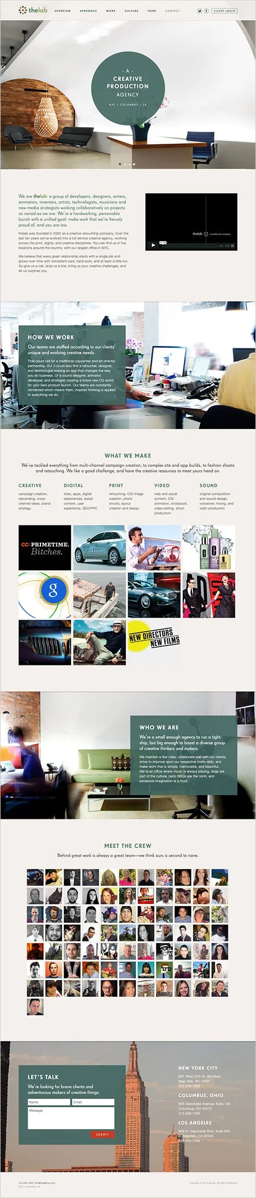
site as a single Homepage
The site was essentially an all-in-one single homepage that did all the heavy lifting. Everything lived there in a who, what, where anchor link format.
All navigation links directed back to the Homepage
Too many dead ends, leaving visitors hanging, with no flow, no chance to explore more.
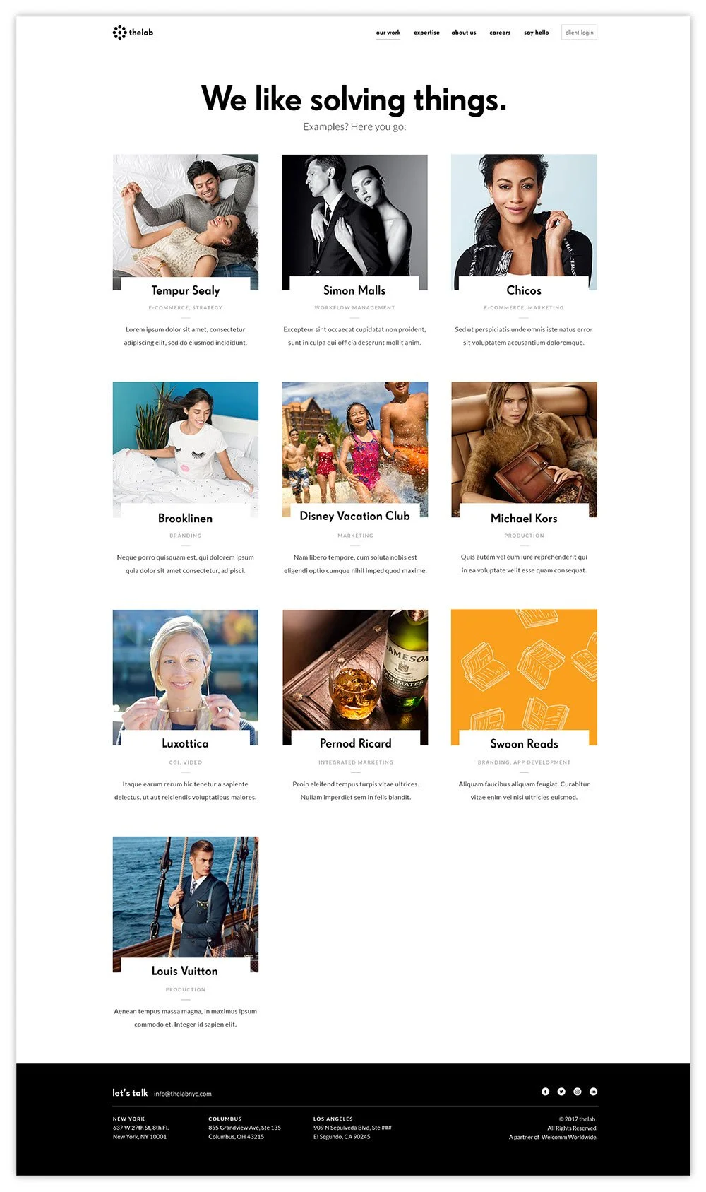
In the Work section, it was not clear that the grid of images were links to projects, as they relied on hover states to convey inconsistent descriptions, not always giving an idea of what each project was about. People had to work to find out information.
Original Homepage
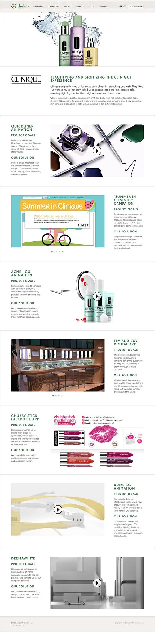
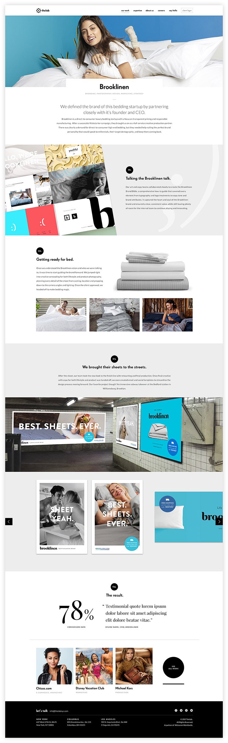
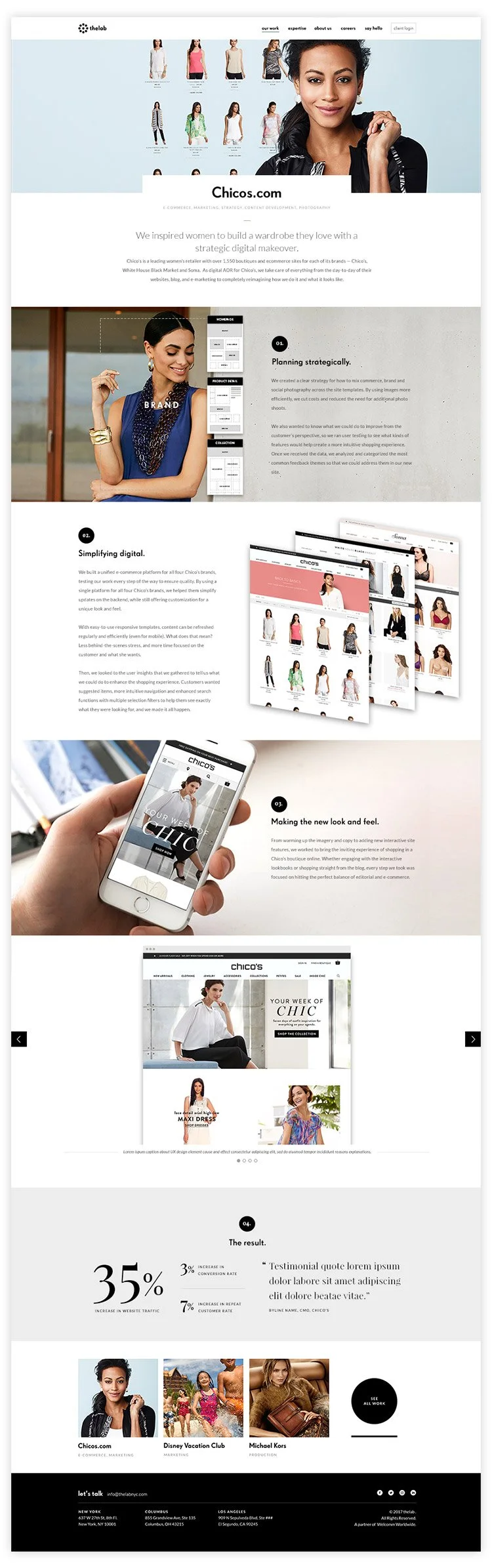
Projects packed into client pages
Work was organized by client since TheLab often worked on multiple projects for one client.
Work pages stated each project’s goal and the services TheLab provided. There was no further detail or insight into the projects.
These pages were dead-ends, with the only links available living in the site navigation. Clicking on “Work” linked back to that anchored section on the homepage.
Original Work Template
Video-Heavy
There was a lot of reliance on videos, including in the intro of the homepage, all which did not auto-play, requiring clicking in order to be viewed.
SIte Strategy
The old site did not accurately reflect TheLab’s digital capabilities, especially their UX capabilities. From my findings, I determined key goals to help modernize the site experience to better represent TheLab:
Clear navigation and no dead-ends
Make the who and the what clear
The why - bring prominence to their value through expertise
Improve the visual design and “digestibility” of content
Navigation
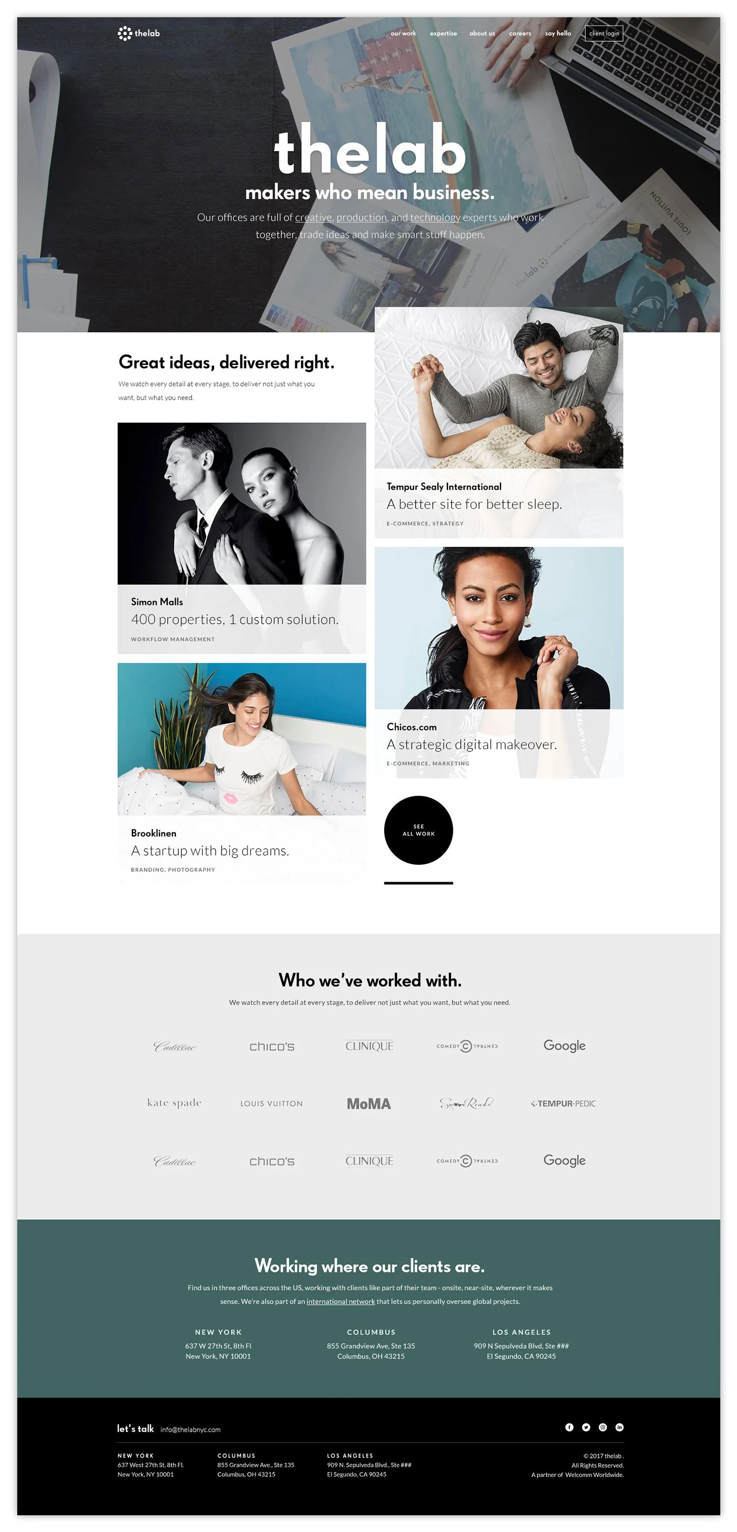
I moved content areas from the old homepage to individual pages where they would have room to expand and say more. These pages would become part of the main navigation. I wanted to help visitors focus on what they wanted to see, and to keep them flowing through the site. I also added more links throughout to help people continue exploring.
Expertise
Full-service
Work and Services had been lumped together in a work section called “What We Do”. To give each it’s own recognition, services would be distinct from work, with it’s own page spotlighting the breadth of TheLab’s full-service expertise.
Share the “how”
Work had been presented as “start” and “finished”, missing the middle — the process. I suggested work be presented more in depth as case studies to show TheLab’s thinking and how they approach different types of projects and the results they achieved, proving their value.
Reduce uncertainty
The old design relied on hover states to indicate clickability on the Work image grid. For the new design essential information clearly displayed project names and services. On the Homepage and Work page, there would also be an additional overview description to help indicate what the project was about.
brand positioning
Makers who mean business
Curious. Ingenious. Agile. Vigorous. Real.
Visual Design
Company websites don’t just illustrate services, they show who they are, what they are like, and how they think. I digested TheLab’s brand traits and RFP’s to gain a full understanding of their personality and positioning. Also, having worked with TheLab on multiple projects before, I had the advantage of having first-hand familiarity of their personality and approach.
Focused and uncluttered
In addition to reorganizing information into scannable pieces, I created more breathing room overall which helped items gain visibility. Previously, everything had been packed together, which made them more prone to getting lost and unnoticed.
Homepage
Work Page
Case Study Template
Case studies would provide context to TheLab’s projects and their approach to them. In order to create an efficient template, I wanted to ensure consistency but also flexibility (since not all projects are the same), I needed to study the projects TheLab might want to include and find out how they approached each one. Once TheLab decided on some projects to feature, I focused on four of them to take into account different types of projects and services, as well as any other variables.
Get the message across visually
To break up the standard of a screenshot of a website or app, I wanted to create imagery that captured the main takeaway, just as a header would. From an e-comm site to custom-built software, I extracted elements from projects to create appealing visuals to help tell the project’s story. I used these designs to form the case study template, and act as a guide to visual style.
Core template elements
Project overview (client name, services rendered, description)
Process highlights
Examples of the the finished product
Outcome
Links to similar projects, and a link back to the Work page
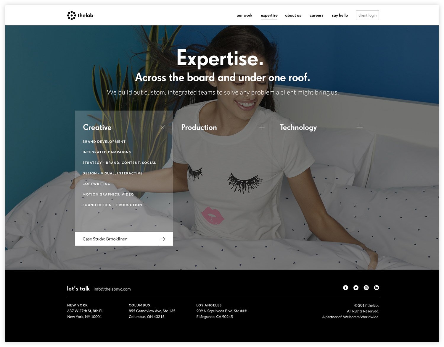
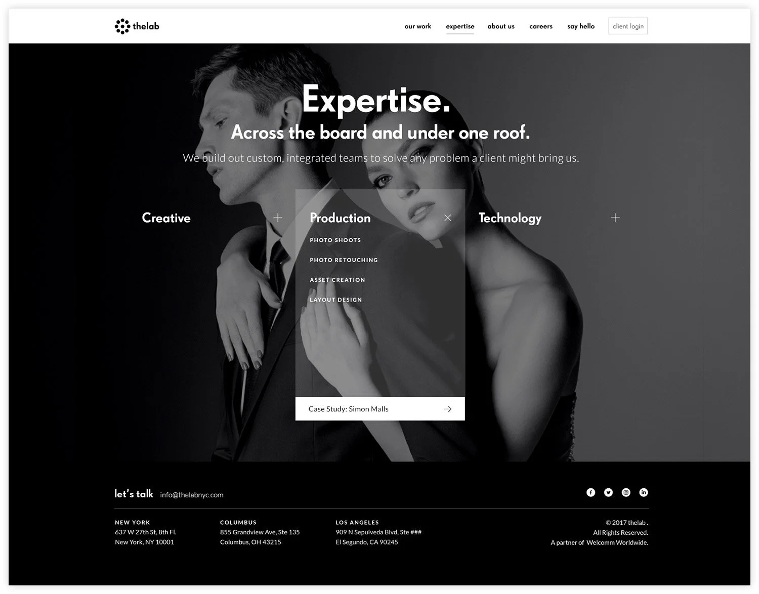
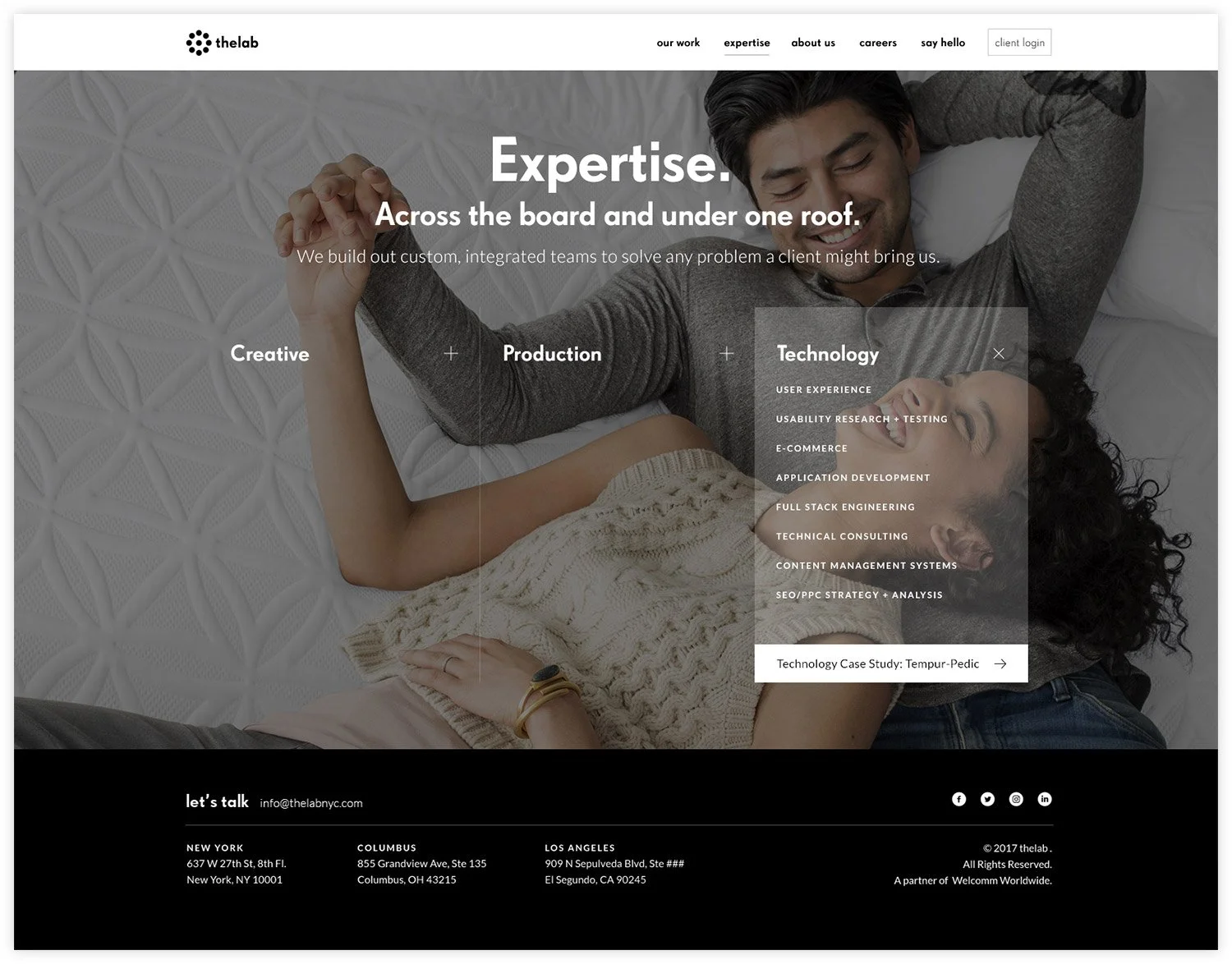
Expertise Page
The original site listed TheLab’s services mid-homepage, lumped into the Work section. Since they pride themselves on being a full-service end to end agency, I wanted to shine a brighter light on their expertise, so that visitors could easily see what TheLab offers. TheLab’s services were organized into their three areas of focus: Creative, Production, and Technology. Each category would also offer a link to a project that employed those services.
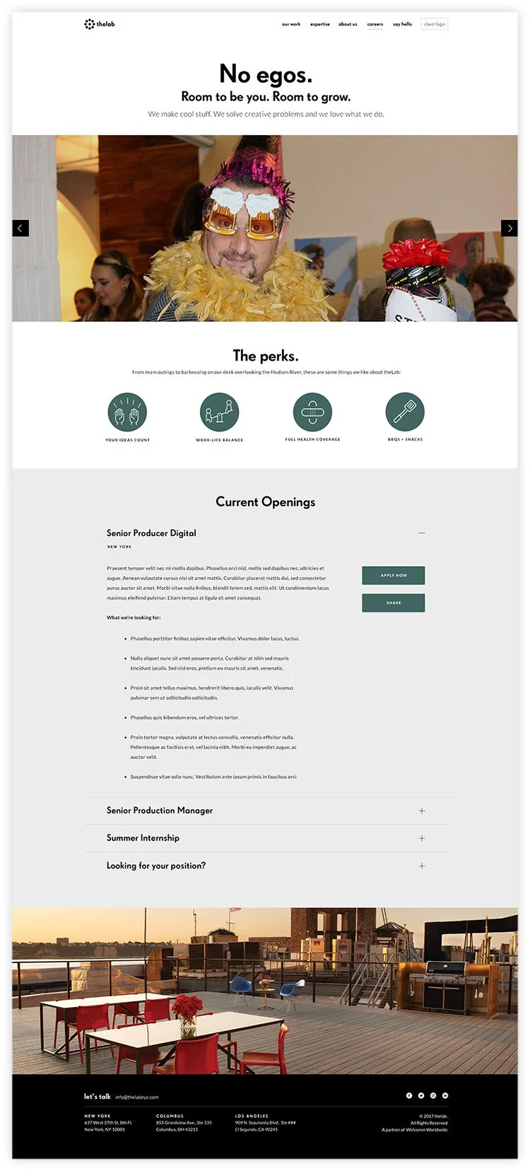
Careers Page
The original site did not have a jobs area. There was a catch-all contact form at the bottom of the page which messaged both potential clients and job-seekers. A Careers page can be more than job listings, it can also be an opportunity to share more of the company’s voice and personality. Again, no dead-ends, so there would also be a call-to-action for job seekers who don’t see what they’re looking for, continuing engagement as much as possible.
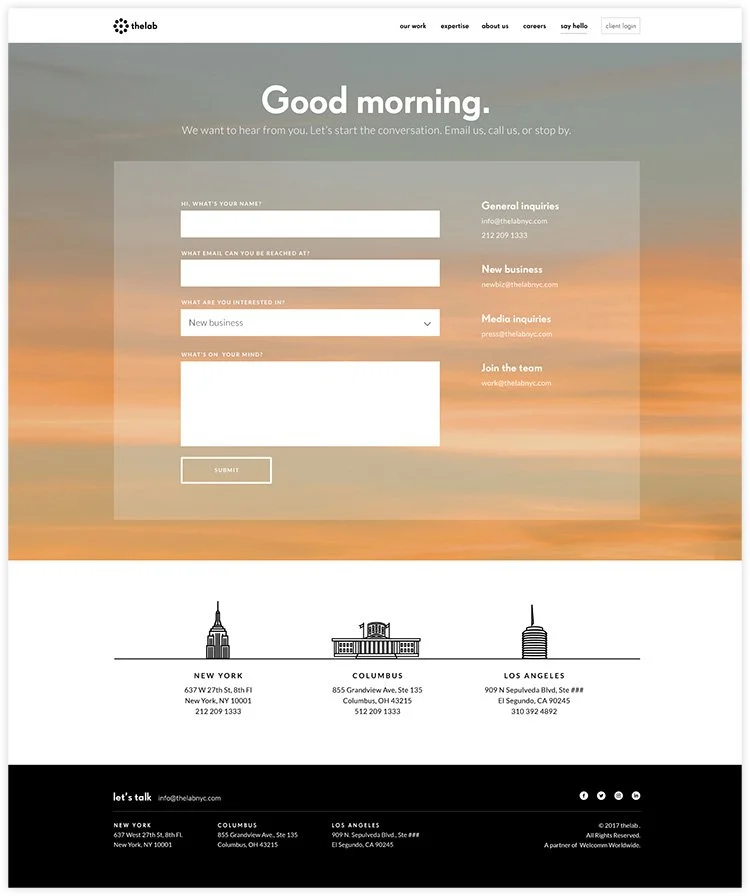
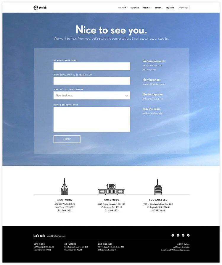
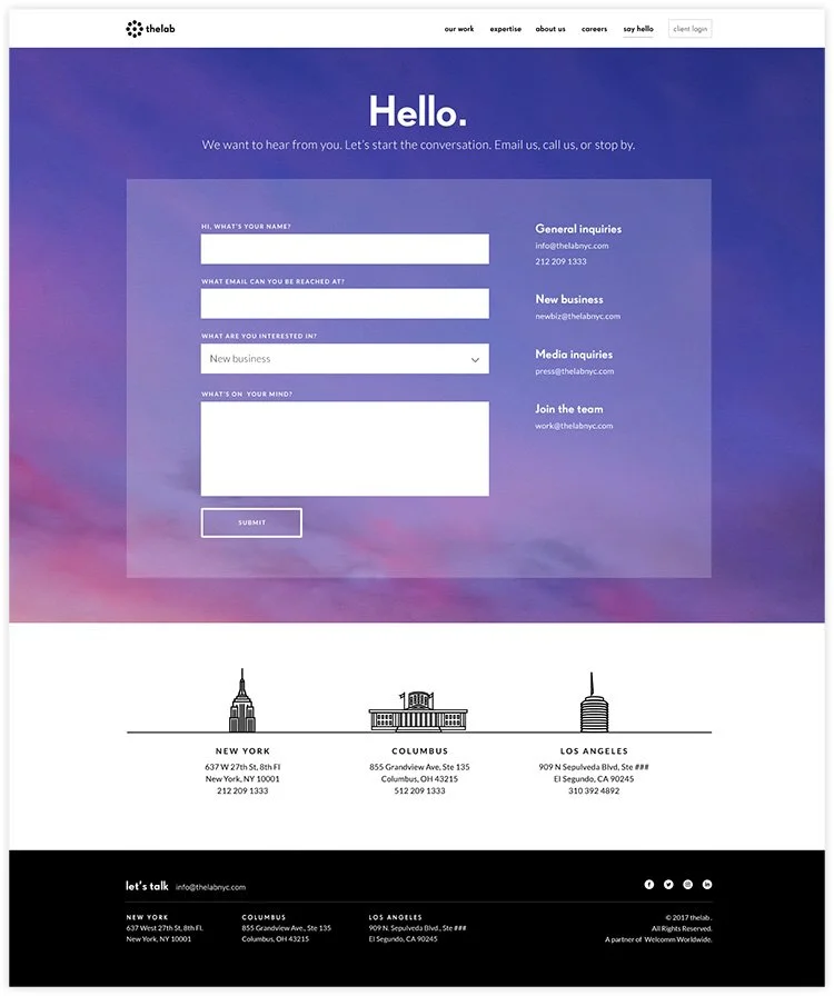
Contact Page
A contact form had originally been at the bottom of the single homepage. In the new design, there would be a contact page that would have a personable greeting and image depending on your location and time of day. It would also incude the three locations of TheLab.
Outcome
The redesign was well-received by TheLab. Case study templates were easy to use, helping them focus on the information they needed to incoporate, and launch their site much quicker. The goal of showing TheLab’s expertise and work culture was achieved.
If there was continued involvement, I would track visitors and site discoverability. I would increase TheLab’s digital presence more in other channels to create a cohesive brand experience. I would suggest company news and thought leadership, and explore other ways to continually refresh the site.