
Soccer.com
Optimizing the purchase flow of uniforms
Agency: TheLab NYC
Role: UX/UI Designer
Team: UX Designer, Copywriter, Developers
• Design of uniform ordering experience
• Information architecture
• Prototyping
• User testing
• UI Components
Outcome
81%
increase in findability
62%
increase in task completion
—
The Goal
Help customers find and order uniforms.
Soccer.com sells a wide-range of apparel and gear. They also sell customized team uniforms for youth clubs. With multiple pathways to uniforms, Soccer wanted to ensure that parents, guardians, and coaches could easily find and order uniforms.
89% received a direct email link
11% did not have a link and would need to search the site
With many variables, the goal was to to help customers get to the uniforms they needed, accounting for multiple use cases and edge cases. However, site flow and navigation were not part of this phase, so we worked around that, creating search options and a dedicated team uniform area. Soccer’s second priority was to promote and cross-sell related products.
I was responsible for UI and created a new visual language. Additionally, I contributed to streamlining UX flows and interactions, ultimately improving usability of the Team Uniforms experience.
Discovery
In order to design effectively, I needed to understand how youth teams are structured, and what variables might exist in terms of clubs, teams, uniforms and the ordering process. This is what I learned.
Team Hierarchy
Clubs consist of any number of teams, without any naming rules for teams.
Club > Team > Player
AYSO Region 1079 > LAG09 > Player Name
AYSO United SoCal > 2020 Fall Core > Player Name
Uniform factors
For the uniform, the club decides what items are required and what is customizable.
Force-required: All items in the uniform kit are required to be purchased.
Optional: Individual items from the uniform kit can be purchased.
Customization: Name, number, no customization.
Soccer.com pre-populates customization when they have the information, otherwise the customer may be required to enter it.
Rostered: Soccer has the player’s name and number associated with an email address.
Non-Rostered: Soccer only has the name of the club, team, and uniform based on position.
Finding the uniform
Without clicking on an email’s direct link, to find the uniform, three pathways were available on the site, which Soccer prioritized in this order:
Search by Email / Sign In
Directly links to any players associated with that email. Throughout the uniform purchase flow, Soccer wanted to prioritize this and encourage people to create an account if they didn’t have one, so that they could save their player.
Search by Club Name > Enter Player Name
Only for a rostered player.
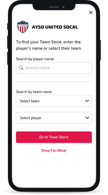
Search by Club Name > Select Team > Select Player
This method could be used for all use cases.
“Team” nomenclature
The site had overlapping nomenclature that caused confusion and lead to different types of content — from info about the benefits of using Soccer to supply uniforms to filtered apparel. Some navigation items were “Team” “Team Uniforms” and “Find Your Team Store”. We focused on this last one which linked to searching for the club uniform and fan wear.
Nomenclature would be addressed in a future phase.
Design
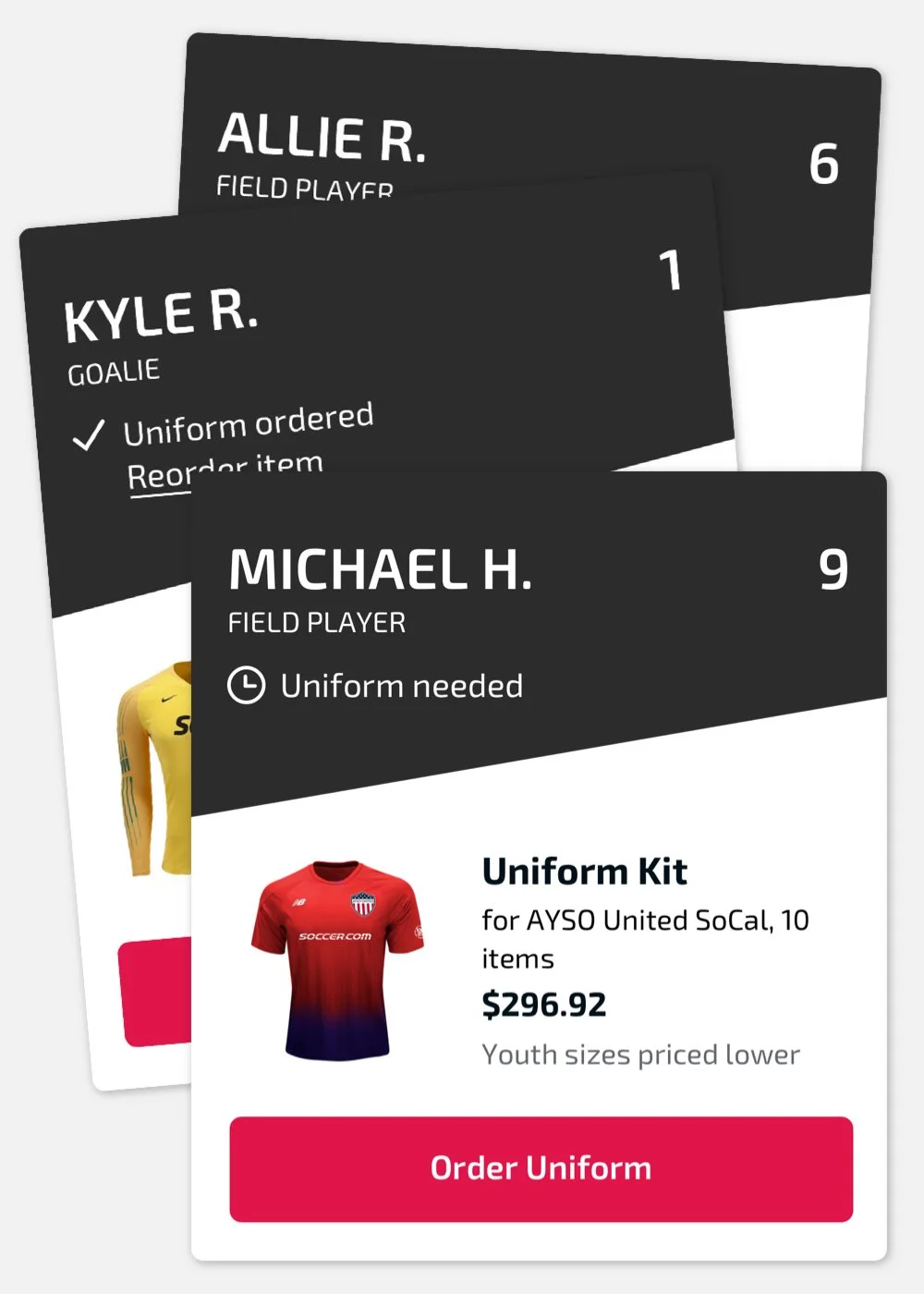
I made valuable contributions to UX, helping to eliminate redundancies, reduce steps, and prioritize the uniform. I also created a distinct visual element for players and uniforms to differentiate from the rest of the site, which was inspired by professional sports trading cards.
Finding the Uniform
Homepage Module
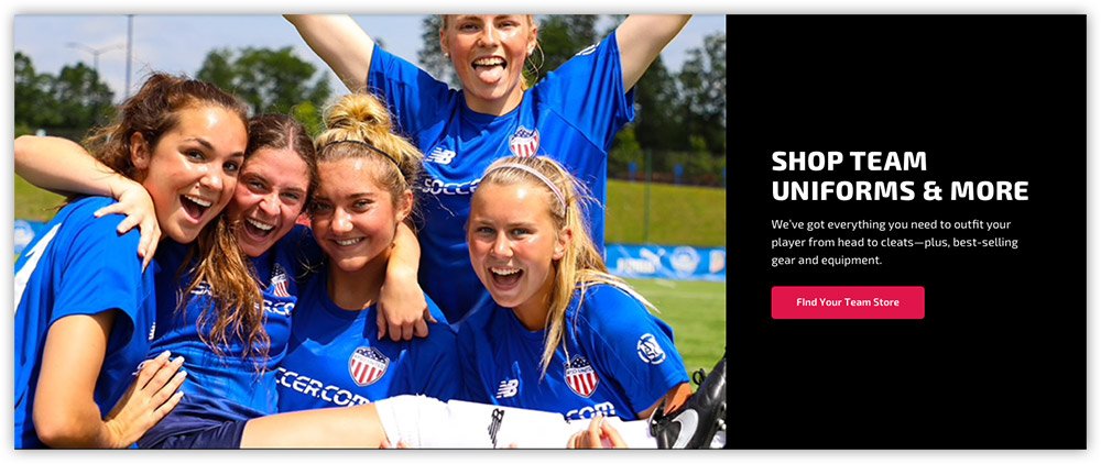
Since changes to nomenclature and global navigation were not in the scope of this project, we wanted to help customers find the uniform in a more obvious way. We created a module on the homepage that would sit right below the hero, to call-out and link to uniforms. The module would account for all use cases and instances: new users and return customers.
HP Module: First-Time Site User
HP Module: Return User
Search
Wires for Search
Search options
Initial wires had offered all three ways to search for team uniforms — all at once, without guidance. I proposed separating these search methods into two distinct pathways, which also reinforced Soccer’s preferred search hierarchy of finding uniforms by email first.
The two paths I suggested were:
Search by email. A direct path not dependent on finding the club first.
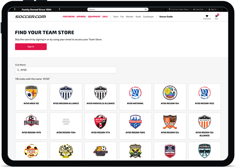
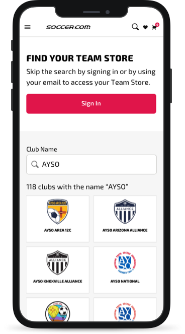
Search by club. Find a uniform by selecting a club, then the player or team. This is also how fan wear could be found by anyone including people who did not need to buy uniforms, like an aunt or uncle.
Search Results
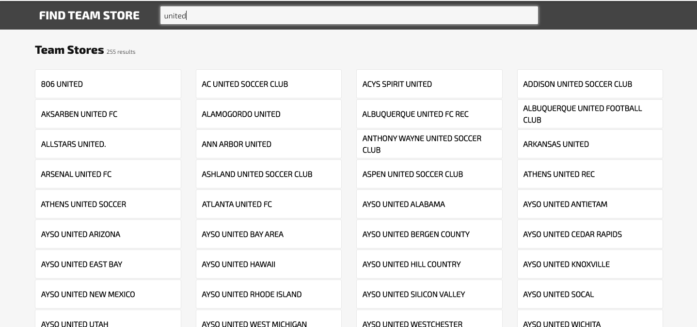
The original search results displayed only the club names. I added the club logos to visually help the customer recognize their player’s club more quickly and easily.
“I proposed separating search methods into two pathways”
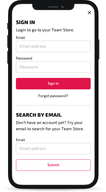
Search by Email
Search by Club
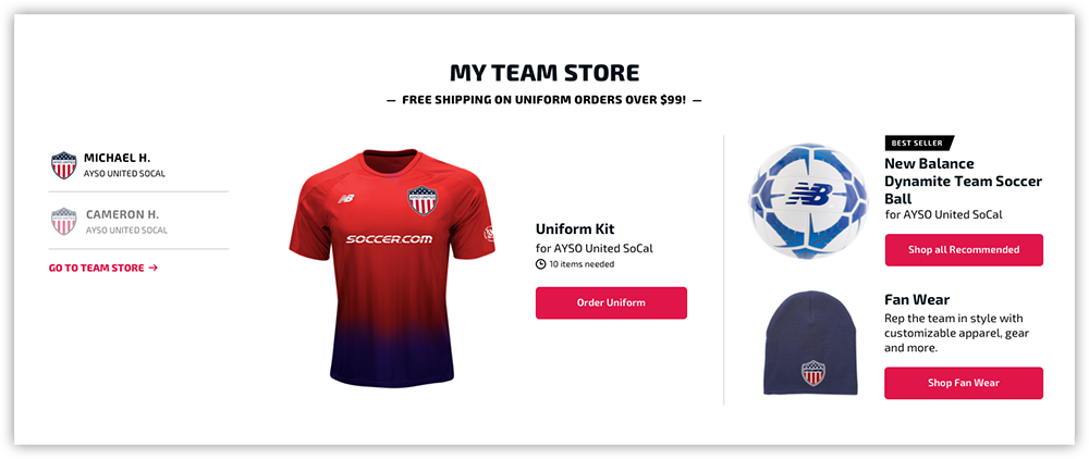
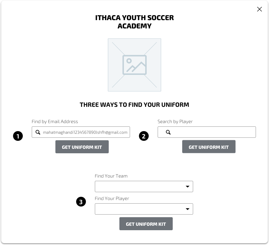
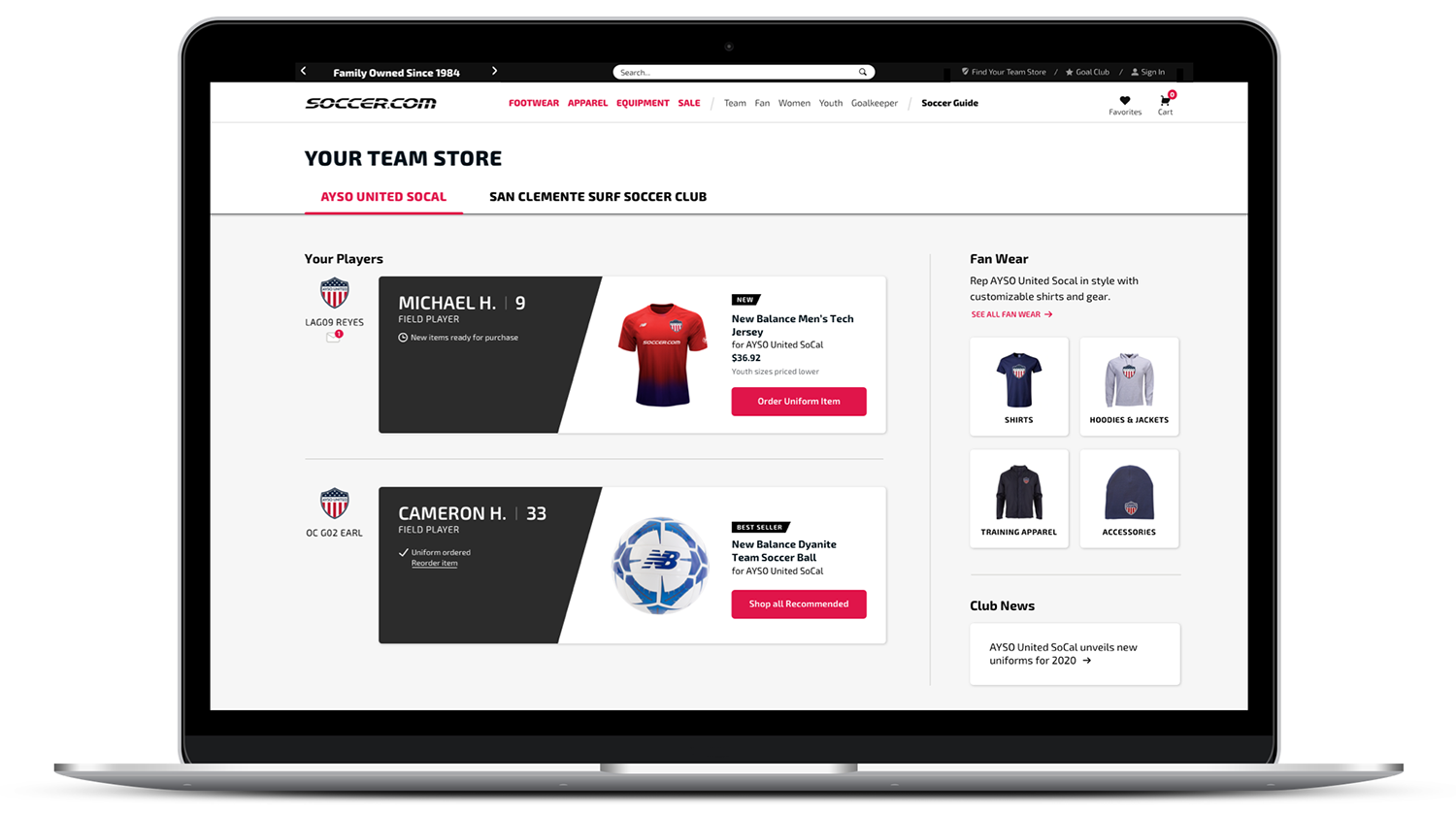
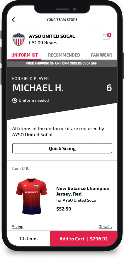
Your Team Store
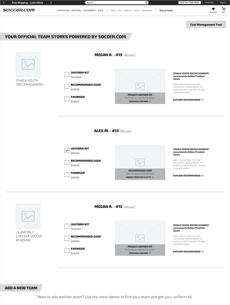
“Your Team Store” was a new area for Soccer. There would be a dashboard which included links to the uniform, recommended products, and fan wear.
Wire for Team Store
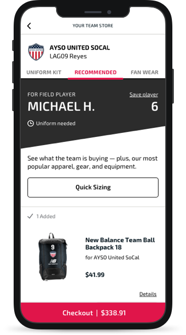
The Dashboard
The dashboard was where signed-in customers could easily scan player(s), info, uniform status, and products. This was especially useful for instances with multiple players.
Wires presented the uniform, recommended products, and fan wear as checkboxes with equal weight. This did not align with the main objective of ordering the uniform. My feedback helped reprioritize the uniform and streamline the dashboard, creating dedicated areas for different needs.
More than one player
All instances needed to be considered — from a single player to multiple players on the same or different teams. As I worked on the Dashboard, it became clear to me that this also needed to be accounted for in the homepage module. Initial wires had been team-centric in the module, so we revisited the homepage and redesigned the module.
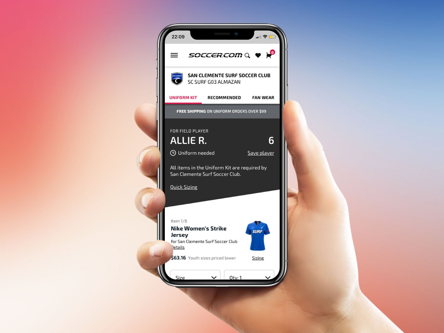
Uniform
I added a uniform status to include in each player’s info, a quick read for the user. If a uniform needed to be ordered, a clock icon was used with the words “Uniform needed”, as a reminder to take action. An ordered uniform was indicated with a checkmark, and provided an opportunity to surface and cross-sell other products.
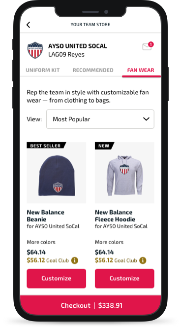
Fan Wear
On the original site, fan wear had been a text banner sitting amongst four other banners ranging in visual size and style. They called out free-shipping, Goal Club membership pricing, recommended products, and FAQs. I gave Fan Wear its own area, adding imagery to create a quick understanding that different types of products would be customized with the team logo.
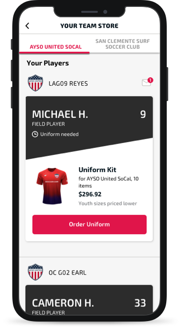

The Uniform Kit
Team Store products were organized into tabs: Uniform Kit, Recommended cross-sell items, and Fan Wear, with Uniform being first priority. Tabs enabled people to navigate between the products they were looking for more easily than links or banners further down the page, and would help maintain focus on each category, minimizing distraction to complete the task. Being player-focused, Uniform Kit and Recommended continued the “player card” visual.
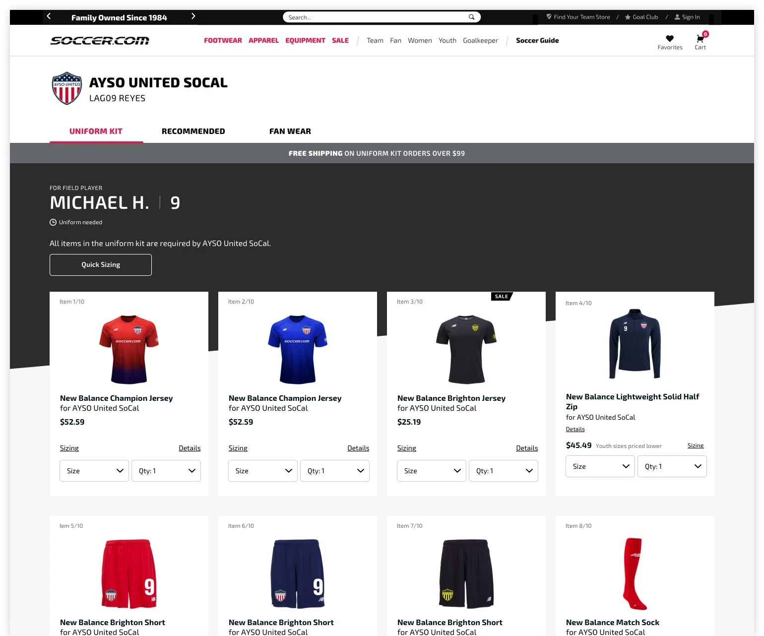
Uniform Variables
The uniform kit included products determined by the club, and clubs had different requirements, from all-required to adding a number. The product tile needed to accommodate for these different states.
Whole kit required
When all items were required, to help customers immediately know how many items were in the kit, each tile included the item count out of a total number.
Club-suggested optional kit
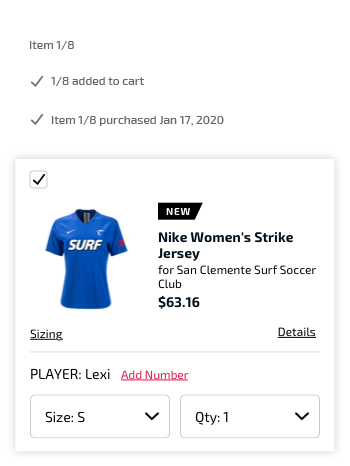
I utilized checkboxes so that people could add multiple items to the cart in one go.
I placed visual indicators at the top left of each product tile. This position was based on the club-suggested instance of the checkbox, and was also determined by mobile-first thinking of vertical scrolling. I made sure that this placement could work across every instance.
Product tile indicators
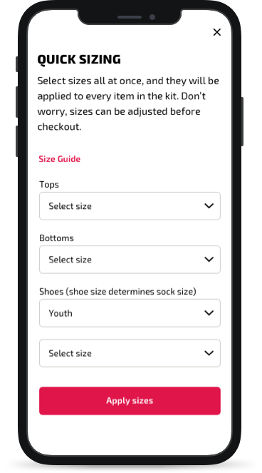
Quick Sizing
Because uniforms kits could contain a lot of items, Soccer wanted to give customers options to help speed up ordering. Quick Sizing would enable the customer to select sizes at once for all the products, instead of selecting a size one by one, per item.
Cross-sell Products
Throughout the flow Soccer wanted to cross-sell products at every opportunity. These products had their own tabs and would be introduced at appropriate times after task completion, like adding the uniform to cart.
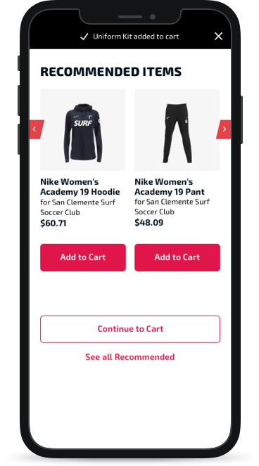
Add to Cart Confirmation Pop-Up
Recommended Tab
Fan Wear Tab
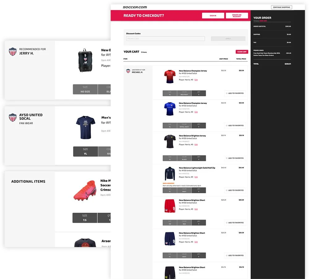
Cart grouping
In the cart, to avoid any confusion, items were grouped together and labeled, distinguishing the uniform from other products. This was helpful to see the uniform as one kit.
Outcome
Testing revealed that users were able to navigate to the team store, easily find the uniform, and add the uniform to the cart. Users also appreciated the Quick Sizing option and recommended products. A positive outcome which would yield better business credibility and trust.
“I just like the fact that it gives you all the items in the uniform kit and the total and the picture of what you’re ordering...for me I’ve got three of them in it so it’s nice to have them kind of broken up like this." — Pat
The new flow was implemented by Soccer’s dev team. Besides design files, handoff included documentation and specs.
If I were to continue on this project, I would consider:
Holistic changes, including improved customer support and fulfillment. A better site experience means nothing if the customer’s experience is not comprehensive.
Changing nomenclature. Multiple navigation items with the word “team” linked to differing areas. Product naming was inconsistent across men, women, and youth products.
Improving accessibility. Sometimes product color was listed, but often there was no text description of the color.
Testing when a quantity selector is useful — in a product tile or in the cart.
Testing how people feel about the available options such as in the uniform search. Is ‘search by player name’ redundant?
Who is buying Fan Wear and who is wearing it?
What would people find helpful for recommended products?
Visually, I would update the branding, as the light grey site background color makes the site look unfinished.